When Dartmouth started its current fundraising campaign in 2001, it expanded its small institutional news service into a full-fledged public relations team under the new office of the Vice President for Public Affairs. The creation of this office was by all accounts an overdue development. In the meantime, students took matters into their own hands by creating Buzzflood; the Tuck School has become a world center for the study of marketing; and alumni have discussed school “branding” (Class of 1963 newsletter).
The PR Office and currently has five members, as described in a profile in PR Week [pdf] and has hired the Manhattan PR firm of Plesser Holland. The firm is experienced in drafting materials and managing reputation but does not claim to be a design shop that focuses on creating logotypes and related images.
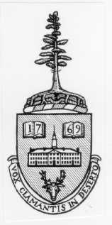
The most notable recent step of Dartmouth’s PR Office is the welcome issuance of the Dartmouth Editorial Style Guide during December of 2005 by its Office of Publications. The Guide sets standards for the use of Dartmouth’s Seal (1773, engr. Nathaniel Hurd), its Shield (1940, W.A. Dwiggins, modified 1957), and the lesser-used White Pine from its Bicentennial Flag (1969). The Shield is properly rendered in black and white; the Seal is properly reserved for official uses. The Guide also mentions an odd little Baker Tower sketch that might fit better in a clip art collection. (More information on the history of some of these designs may be found in the Library Bulletin.)
Dartmouth does not yet have a comprehensive set of “visual identity guidelines,” a set of standards that would cover the images mentioned above as well as lay out appropriate uses of an official typeface and coat of arms. Some schools developing clear and comprehensive guidelines that include all of these elements are Brown, Cornell, Cambridge.
A coat of arms is a heraldic device that would exist alongside the Seal and Shield, and it is something the College needs. The most recent proposal for a coat of arms features Dartmouth Hall (unlike the above devices, which feature hypothetical buildings) and includes the school’s motto as well as a buck’s head from the arms of the Second Earl of Dartmouth.
Dr. Good’s proposed arms, in black and white
Because a heraldic coat of arms is by nature an adaptable arrangement of colored elements on a field, this design would be suitable for a much wider range of applications than the Shield, which is exclusively a black-and-white line drawing.
Following are some indications that a coat of arms is needed:

This Shield uses colors other than black and white and incorporates an inappropriate drop shadow.

This shade of lavender (presumably derived from the face of Baker’s clocks) belongs in the palette, but this logotype makes the institutional subunit look more independent and important than the Tuck School.

The nonstandard logotype above diverges in size, font, arrangement, and color from the one the school should adopt; the Shield within it also is highly unorthodox. (Dr. Good also notes that it eliminates the Indians from Dartmouth’s Seal.)
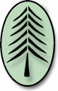
This one uses an attractive but nonstandard version of the White Pine.
The point is not that the new guidelines, which would prevent most of the uses above, are being enforced insufficiently. The website of the Technology Transfer Office needs color in its graphic identification with Dartmouth. The point is that it is inappropriate to transform the Shield into some sort of color logo or coat of arms in graphic-design terms as well as heraldic ones, and that Dartmouth therefore needs a coat of arms, which may be rendered in color or black and white as well as abbreviated, with smaller elements standing for the whole.
The PR Office, as the manager of the school’s visual identity, is the proper body to request the official adoption of a coat of arms and to then specify its use in exactly these situations. The office is probably too busy at the moment, but if it ever commissions a set of visual identity guidelines from an outside firm, as the schools listed above have done, it should include a coat of arms in the specifications for the project. The variety of logotypes that Dartmouth needs (and already is trying to use) simply requires a coat of arms: a black-and-white line drawing from 1940, however traditional and useful in some situations, is far too limited for what Dartmouth requires.
[04.08.2006 altered slightly.]