I. The Geisel School. The big topic in Dartmouth heraldry is the Geisel School of Medicine’s new shield, mentioned here. It contains the familiar elements of the river, pine, founding date, and book, and it omits the depiction of the old Medical Building, which was demolished about 55 years ago. It deserves an analysis of its own.
II. The Graduate Studies Program. The Grad Studies shield seems to be receiving a big push, with a banner for Dartmouth Night (Grad Studies’ Flickr photostream) and the distribution of decals to students (Flickr).
The shield carries on what seem to be the unifying elements in Dartmouth’s armorial family: (1) the use of a founding date and (2) the placement of wavy lines in the base of the shield to represent the Connecticut River.
Here is how it looks in the group (published in March, shortly before the medical shield was replaced):

The vertical year on the Grad Studies shield does not seem entirely successful in this rendition.
III. The Tuck School.
Graphically, the chunkiness of the Tuck shield, at the far right above, is appealing. It uses an extreme closeup view to cut off the building’s eaves, and its heavy line causes the shield border itself to read as part of the temple front. The Eighteenth-century letterforms are also nice and relate to Dartmouth’s seal, although they are not of the same 1990s (?) language as the rest of the Tuck shield.
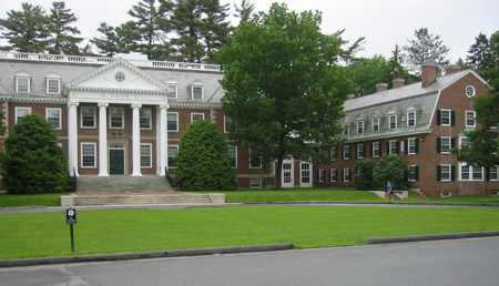
The one thing that has always been disturbing about the Tuck shield is that it depicts a nonexistent building. It is not a stylized version of Tuck Hall’s portico; instead it represents a hexastyle Doric temple, like the temple at Hephaestos.
Compare the row of six squat columns without capitals in Hephaestos to the Ionic portico of four relatively attenuated columns in Tuck Hall:


Perhaps this should not be irksome, since Dartmouth’s own shield depicts a nonexistent building as well. One way to resolve the problem would be for the Tuck School to build a hexastyle temple front somewhere on its campus.
—————
[Update 08.16.2012: Green temple-only illustrations added.]
I think it’s unnecessary and inconsistent.
“The Eighteenth-century letterforms are also nice and relate to Dartmouth’s seal, although they are not of the same 1990s (?) language as the rest of the Tuck shield.”
But is it appropriate to render the date “1900” in eighteenth-century letterforms?!
Chris, thanks for writing. I certainly don’t think the shield is based on Hephaestos, only that it is not accurately based on Tuck Hall (and happens to be more like a Doric portico such as Hephaestos than it is like Tuck Hall). Yes, Doric columns are not perfect cylinders, but the way to stylize them is by making them cylinders. Ionic volutes such as Tuck Hall’s are generally stylized as small circles rather than left off, as they are left off this shield. (Incidentally, Ionic columns also often exhibit entasis or widening/narrowing.) Adding an oculus to the gable shows that the image is meant to refer to Tuck Hall, but that doesn’t make the number of columns correct (see the version with the border removed above).
And if you were to treat the border as not representing two outer columns, it seems to me that the overhang of the eaves would be extreme (see the quadristyle version above). I think it’s not a coincidence that the same line weight is used for the building elements and the border. Again, I like the Tuck shield, and I don’t think a shield is required to be completely accurate; the building on Dartmouth’s shield almost certainly did not exist. Perhaps instead of referring to a “nonexistent building” for Tuck, I should have said that Tuck Hall is so stylized that it seems to gain a pair of columns.
I think the Geisel shield adopts its own shape (and its own asymmetrical, multi-bordered divisions) just for graphical or logo-design purposes. If any of these shields were strictly heraldic, I don’t think the particular appearance of any one artist’s version would matter: the elements could be shown on any shape of shield or no shield at all (such as on a letterhead, banner, car door, dinner tray, etc.).
Tuck’s Shield undoubtedly contains a stylized representation of Tuck Hall – Firstly, the circle on the portico in the shield corresponds directly to Tuck Hall, and is not found on any Greek temple. Secondly, as you say, Tuck’s columns are Ionic, while the Temple at Hephaestos uses Doric columns, which taper significantly as they rise. Lastly, while the shield does cut off the buildings eaves, it does not cut off the gable, making the cut off a decision meant to reflect the actual proportions of the portico and architrave. The most likely scenario is that the border is just that – a border, which would create four columns, as Tuck actually has, rather than the six you claim, and the overlapping of portico and border constituted an attempt to keep it from appearing too small. I also suppose it is possible that the designers of the shield did not care to create such an exacting representation for whatever reason. Lastly, a question – Why do you think the Geisel Shield abandons the shape of each other division of the College? Even the relatively new Graduate Studies shield adheres to the standardization of shapes.