If you’re working on the branding effort (see the previous post on the topic), I would recommend a visit to the archives to see some things:
- The green ribbon and its story. The college is represented by a single color.
- Typical accent colors are black, lavender, and white. White is used frequently in athletics. No big green-and-gold tradition seems to exist.
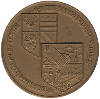
- The seal and its history. More effort could be devoted to reserving the seal for official uses only.
- The midcentury shield now in use, and the recent proposal for an heraldic coat of arms.
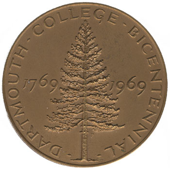
- The Bicentennial medal designed by Rudolph Ruzicka.
- Anything designed by John Scotford.
- Anything produced by the Stinehour Press (photo of exhibit, Valley News story) or Ray Nash, of the Graphic Arts Workshop (Rauner bio); also books published by the Dartmouth College Press.
- Copies of the ORC from various periods.
- Copies of The Dartmouth from various periods, especially before WWII.
- Carnival posters, especially those produced before 1959.
- Things made of leather and wood: Daniel Webster’s water bucket and old ski boots, senior canes and snowshoes.

Around campus, you might take note of the white color of Dartmouth Hall and the finely-speckled gray/white of the granite used in the foundations of many buildings. (That granite is not likely to be local; for a local granite, see the pinkish stone of Rollins Chapel, a stone that has not been used very widely on campus.) The brick walls with their varied colors, from black to brown to red, are characteristic of the campus, although the style of brickwork was originally called “Harvard brick.” There are many useful greens, including the patina of the copper roofs, the paint used on building shutters, the color of the shaggy pines along the riverbank, and the sometimes-black color of the river itself. An example of lavender appears in the glass of the Baker Tower clock.
A list of style guides from Logo Design Love has some nice examples. Duke’s guide announces that the word “University” in the Duke wordmark is set in Interstate, the typeface developed for road signs by the Department of Transportation. Yale’s identity site is prepared by the Office of the University Printer rather than the PR office. Princeton’s guide (pdf) on page 21 explains the difference between the seal and the shield, and it goes so far as to deface the seal with the word “SAMPLE” since, as the text explains, the seal is not for the public — not even by way of example! (Unlike B.U.) Oxford’s logo page has great visual appeal and actually is fairly flexible in its rules. University College Oxford has a guide by Franks and Franks (portfolio example) that looks nice and builds a traditionalist logotype around an abbreviation and nickname (“Univ.”).
—–
[Update 05.03.2014: Broken link to Princeton guidelines replaced; point about “SAMPLE” no longer valid.]