The Valley News has a piece by Tris Wykes on the growing use of the Lone Pine in athletic branding. See also the article “Stand Tall Lone Pine” (Peak (Winter 2015) pdf).
John Scotford [one letter t in his name] designed the pine for the 1969 Bicentennial. The school actually released several different versions or iterations of the logo, and several different representations of a pine tree, most if not all apparently by Scotford:
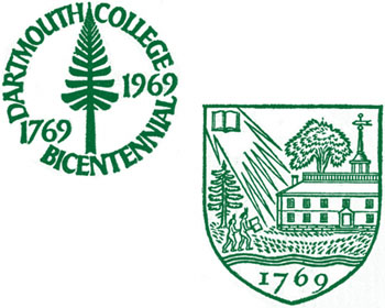
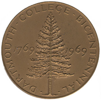
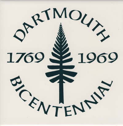
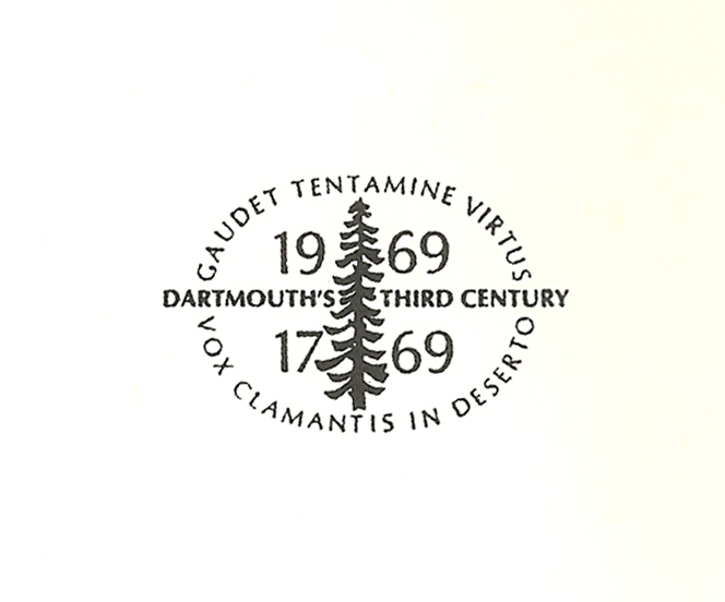
Of course the actual Lone Pine — earlier known as the Old Pine, although it was not extremely old, certainly not as old as the school — did not look like any of these, but that is beside the point. (Scotford also designed the 1969 Dartmouth College Case stamp, a realistic image that does not depict any pines.)
With the rise of the pine, apparently the athletic logotype commissioned from SME, Inc. in 2005 (pdf) is going away.1This is good news. I could never figure out that logo. Is the triangular background form meant to represent the gable of Dartmouth Hall? Then why make its essential peak tiny and hide it inside the letter D, where it gets lost on banners and uniforms and Web graphics? But then the upper part of the shape cannot be Dartmouth Hall, because the lower part of the shape is an upward-broadening trapezoid. There is no building at Dartmouth like that.
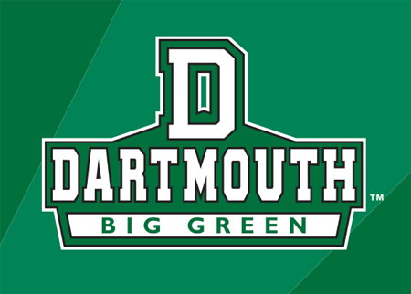
That logo is completely skipped over by the VN article, which goes from the Big Green nickname (dating to the early 1900s,2The Dartmouth 31:__ (___, 1909), 206 (Google Books). Football games between Dartmouth and the “Indians” of the Carlisle Indian School of the 1910s were called Dartmouth-Indian games — a clear indication that Dartmouth teams were not the Indians. not a replacement for the later Indians nickname) right to the Lone Pine. Neither the Athletic Department’s improving website nor the Football Team’s website uses it.
—————
| ↑1 | This is good news. I could never figure out that logo. Is the triangular background form meant to represent the gable of Dartmouth Hall? Then why make its essential peak tiny and hide it inside the letter D, where it gets lost on banners and uniforms and Web graphics? But then the upper part of the shape cannot be Dartmouth Hall, because the lower part of the shape is an upward-broadening trapezoid. There is no building at Dartmouth like that. |
|---|---|
| ↑2 | The Dartmouth 31:__ (___, 1909), 206 (Google Books). Football games between Dartmouth and the “Indians” of the Carlisle Indian School of the 1910s were called Dartmouth-Indian games — a clear indication that Dartmouth teams were not the Indians. |
Of course — home plate!
It’s not a building, it’s an oblique home plate.