BASIC at 50 and other items

  • Work continues on the Williamson Translational Research Building at the hospital in Lebanon. Here is a notable tidbit about the building’s namesake donor, the late Dr. Peter Williamson ’58: he once owned the ultimate collector car, Lord Rothschild’s Bugatti Atlantic. Williamson’s car won the Pebble Beach Concours in 2003 and is now in the Mullin Automotive Museum.
  • The Rauner Blog post on E.E. Just has a great old photo of Hallgarten. The building was built for the state ag school, known then as N.H.C.A.M.A., and its rear ell is the only part of any building from the campus to survive. The school later moved to Durham and became U.N.H., as its football website points out (via Big Green Alert). Of course, the most meaningful fact that relates to the football rivalry is that Dartmouth’s Memorial Field, indeed the entirety of its athletic complex west of Park Street, was built on one of the state farm fields. The students of the N.H.C.A.M.A. learned how to raise crops in the place where Dartmouth students now play football.
  • A group called Project VetCare is buying a house in Hanover, apparently around 65-75 Lebanon Street, to provide housing for veterans, including students (The Dartmouth).
  • Dartmouth Medicine has had a redesign by Bates Creative.
  • Wouldn’t it be interesting if the U.S. had national food appellations (Wikipedia) beyond the grape-growing regions designated by the AVA? There simply is no equivalent to the geographical indications and traditional specialities of the EU (PDO, PGI, TSG), the AOC of France, or the DOC of Italy. Not all traditional foods are old — Birmingham Balti has been proposed for the list of U.K. foods given protected status, and farmed Scottish salmon is already listed.
  • Kendal has demolished the Chieftain (Valley News).
  • Crouching Spider is going away (Flickr).
  • Dartmouth has talked about changing the name of the overall institution — the umbrella under which the undergraduate college and the graduate and professional schools operate — from Dartmouth College to Dartmouth University. The purpose would be to raise the school’s standing among observers, mostly outside the West, for whom “college” can mean a secondary school or lower school. A fascinating example of this renaming motive is found in Trinity College Dublin, another school that has landed outside the top 125 in the Times World University Rankings. Trinity was founded in 1592 (Wikipedia) as a constituent college of the University of Dublin. What makes Trinity odd is that the University never added any other colleges — Trinity is all there is, and yet the university administration survives, under its own name. Trinity’s rebranding now proposes to replace “Trinity College Dublin” with “Trinity College, University of Dublin.” Oh well; at least the “improved” name seems historically-grounded and technically accurate. Brian M. Lucey argues against it in a blog post, and another post. The real controversy in the rebranding involves the coat of arms:
  • Although the Irish Times claims that the Bible is being removed from Trinity’s arms, that does not necessarily appear to be the case. According to an informative paper by Professor John Scattergood (pdf, via Brian M. Lucey), the arms, as formally granted in 1901, require “a Bible closed, clasps to the dexter.” The rebranding includes a new, stylized version of the coat of arms that substitutes an open book, something that easily could be called “a Bible open.” Visually, neither one of the shields identifies the book to the ordinary observer. The changes in colors are all part of the stylization and do no violence to the underlying historic coat of arms. (The University of Dublin obtained its own arms in 1862, and they contain an open book, incidentally.)
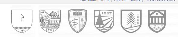
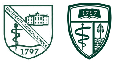
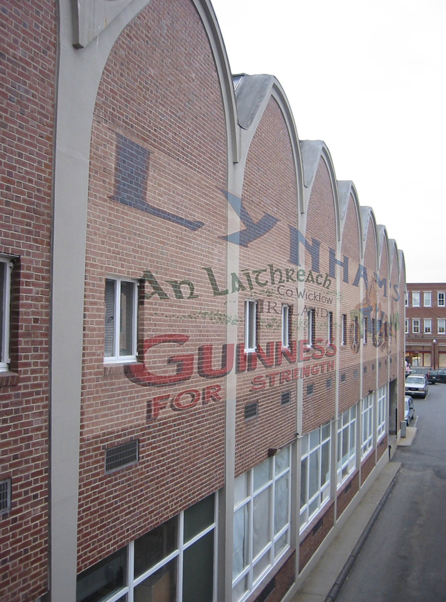
  • UNH has picked a new logo, a shield designed by Chermayeff & Geismar & Haviv. This shield is not one of the three shields that the firm initially proposed last year (post). Although a couple of those first ideas were intriguing, students and alumni were not pleased. The new identity guide (pdf) notes that “The specific blue color has been made a bit brighter than the past version.”
  • Just for your information, the maximum number of effective footnotes in a Word document (Word:Mac 2008) is 32,768. Notes above that number fail gracefully: they still work but are numbered incorrectly, all sharing either the number 32768 or one of a few numbers after that.
  • The school’s Flickr feed has a nice set of historic photos titled “BASIC at 50: The Democratization of Computing.” It is especially gratifying to see the buildings identified: the College Hall basement, Kiewit, and so on. (In the lower right corner of another view of Kiewit is a glimpse of someone who could have been a predecessor of Usenet celebrity and campus character Ludwig Plutonium.)
  • This fantastic photo of President Kemeny with his BASIC license plate was taken in the parking lot east of Bradley/Gerry, it appears, and has the rear addition of the Church of Christ for a backdrop (somewhat near this present-day Google Street View).
  • From an article in The Dartmouth on planning VP Lisa Hogarty: “The biggest change in the College’s capital budget, she said, will come from the proposed expansion to the Thayer School of Engineering.” See the sample master plans of Koetter Kim (post) and Beyer Blinder Belle (post) and the Thayer press release on President Hanlon’s 2013 expansion announcement.
  • The news that a family had donated $100m to support Hanlon initiatives makes one think of the Harkness gifts to create “residential colleges” at Harvard and later Yale, but reading The Dartmouth, one learns:

    Mastanduno said this gift represents a significant departure from past donations, which have tended to focus on capital infrastructure.

    “This isn’t about bricks and mortar,” he said. “It’s about the core academic mission of Dartmouth.”

—–
[Update 04.17.2014: Broken link to Mullin removed, Kendal spelling corrected.]

The Geisel School’s identity guidelines and their breaking

The Geisel School’s thorough Visual Identity and Naming Conventions (pdf) state:

FIRST REFERENCE:

+ The Audrey and Theodor Geisel School of Medicine at Dartmouth

OR

The Geisel School of Medicine at Dartmouth

Although the web version of the medical school magazine for Fall ’13 has no logo graphics on its table of contents, it describes itself in the masthead as “The magazine of the Geisel School of Medicine at Dartmouth”. The website of the school itself features this graphic:

Geisel logotype 2012

Detail from Geisel School website, December 2013.

So far so good. This form of the name complies with the conventions.

But when one views the pdf version of the same magazine table of contents, one sees this:

Geisel logotype 2013

Detail from Geisel School magazine, December 2013.

The school’s Youtube channel also follows this new form. Not only does this reordering violate the first rule of the Guidelines, it violates the second:

SECOND AND SUBSEQUENT REFERENCES:

+ Geisel School of Medicine at Dartmouth

+ Dartmouth’s Geisel School of Medicine

+ Geisel School of Medicine

This transition was first spotted by Joe Asch at Dartblog.

New branding push likely

President Hanlon has named Cornell’s PR head, Thomas Bruce, to a similar position at Dartmouth (Dartmouth Now, via The Dartmouth). The Dartmouth reports that Bruce “oversaw the redesign of the university’s logo” at Cornell.

Indeed, Cornell’s massive “Brand Book” covers everything, from the essence of the Cornell brand (our brand “speaks to the satisfaction and emotional connection we provide to our stakeholders”) to the proper use of the logo — with the obligatory gallery of misuse. Cornell modestly uses Palatino as its primary typeface, gives the proper abbreviation of its motto (“… any person … any study.”), and specifies the correct shade of red.

—–
[Update 10.05.2013: It appears that Cornell’s identity project was done by Chermayeff & Geismar & Haviv. That firm is the same one that nicely simplified the Brown University coat of arms and replaced the busy seal of the Harvard University Press with a simple design appropriate for book spines. Also in the firm’s portfolio are logos for such obscure brands as the Smithsonian Institution, NBC, National Geographic, the U.S. Bicentennial, and PBS.

And hey, look at this: the firm recently proposed three new logos for UNH (Manchester Union Leader). The school is still deciding which one to use. Of the three alternative directions, the middle one seems the most appealing: it has the uniform solidity of a railroad herald — or maybe it can’t avoid recalling Herbert Matter‘s work for the New Haven Railroad.

Some of the push for branding at Cornell came from a student-run image committee, as a 2006 New York Times article explains:

But when committee members first approached administrators to talk about their concerns'” including what they saw as the university’s passive response to a slight drop in some ranking guides'” they met with resistance.
That changed three years ago, they said, with the arrival of a new president, Jeffrey S. Lehman, and the subsequent appointment of Mr. Bruce, who took their critique seriously, particularly their thoughts about the so-called view book for potential applicants and about the Web site.

Dartmouth had a similar student group around that time, called Buzzflood (The Dartmouth). Founder David Gardner describes it as “an organization that aggregated, created, and spread positive community news” (Gardner’s ColorJar bio). The Buzzflood website had received three million hits by 2005 (PRWeb) but it folded that year (The Dartmouth).]

The new campus map is out; other topics

  • That Occom Ridge house that was captured in a state of extreme disarray in various aerials has indeed been replaced by a new house by Haynes & Garthwaite. Bing has a more recent aerial view.
  • The graduate and professional schools’ heraldry is on display on the college’s new website. The graduation gowns of the schools also carry uniform shields now, with Flickr examples of Tuck, Thayer, and Graduate Studies. The Trustees get the Old Pine.
  • The Planner has a post presenting the new campus map. This is an almost-final version of the traditional paper map. It’s notable that the two freestanding lounge buildings in the Choates are given their own names, Brittle and Bissco, for the first time on a campus map. I lived in the Choates during the early ’90s and don’t recall those names being used, even informally.
  • The Friends of Hanover Crew have a new design for the site. It is hard to remember, but the prior design might have made more use of Wilson’s Landing Road.
  • Thanks to Melvin I. Smith for the citation to the Old Division Football paper in his Evolvements of Early American Foot Ball: Through the 1890/91 Season (2008).
  • The Rauner Blog has a nice post on the dedication of Rollins Chapel and Wilson Hall. It’s always interesting to see this fraternal twin to Rollins, designed by the same architect (John Lyman Faxon) in Newton, Mass. (See also the Bing view.)


The “Dartmouth University” proposal

The strategic planning report for the “Global Dartmouth” working group (June 2012), released today, makes six proposals, including this one:

6. Rename Dartmouth for international audiences, by:
-Using “Dartmouth University” or some equivalent to refer to the institution as a whole.
-Using “Dartmouth College” to refer to the undergraduate school of Arts and Sciences.
-Maintaining existing labels for other schools.

——-

03.07.2013 Reactions:

One must presume that the working group is not completely tone-deaf and is instead exaggerating for effect. If international public relations is such a problem, then the solution is more or better public relations. The facts that Imperial College London is at number 8 and King’s College London is at number 57 in the Times rankings tend to suggest that this is the case. Each of those “colleges” is a public research university ranked at least 60 places above Dartmouth.

If a name change really were needed for the international market, one would imagine that the first step would be to continue to deemphasize “College” (for example, “William & Mary” is listed as such by the Times) and the second step would be to add an explanatory tagline to the website and other publicity materials provided outside the U.S.:

Dartmouth, an Ivy League University

Dartmouth College, a Small Research University

Rutgers, the State University of New Jersey

The Sunset, a Small Motor Inn

On the other hand, if the proposal were taken seriously, this is how it would play out: the Board would announce, as part of the Sestercentennial1The College of New Jersey, known colloquially as Princeton College, changed its name to Princeton University at its Sesquicentennial in 1896. It still polices the use of the College of New Jersey name. in 2019, that the arts and sciences undergraduate program would always be Dartmouth College but that the historic umbrella institution, which had never had a name of its own, would be called Dartmouth University.

shields of Dartmouth University

——-

References
1 The College of New Jersey, known colloquially as Princeton College, changed its name to Princeton University at its Sesquicentennial in 1896. It still polices the use of the College of New Jersey name.

Heraldry: The Tuck School and the Temple at Hephaestos

I. The Geisel School. The big topic in Dartmouth heraldry is the Geisel School of Medicine’s new shield, mentioned here. It contains the familiar elements of the river, pine, founding date, and book, and it omits the depiction of the old Medical Building, which was demolished about 55 years ago. It deserves an analysis of its own.

II. The Graduate Studies Program. The Grad Studies shield seems to be receiving a big push, with a banner for Dartmouth Night (Grad Studies’ Flickr photostream) and the distribution of decals to students (Flickr).

The shield carries on what seem to be the unifying elements in Dartmouth’s armorial family: (1) the use of a founding date and (2) the placement of wavy lines in the base of the shield to represent the Connecticut River.

Here is how it looks in the group (published in March, shortly before the medical shield was replaced):

Shields image from Vox the Vote
Shields representing Dartmouth and Associated Schools, from Vox the Vote.

The vertical year on the Grad Studies shield does not seem entirely successful in this rendition.

III. The Tuck School.

Graphically, the chunkiness of the Tuck shield, at the far right above, is appealing. It uses an extreme closeup view to cut off the building’s eaves, and its heavy line causes the shield border itself to read as part of the temple front. The Eighteenth-century letterforms are also nice and relate to Dartmouth’s seal, although they are not of the same 1990s (?) language as the rest of the Tuck shield.

The one thing that has always been disturbing about the Tuck shield is that it depicts a nonexistent building. It is not a stylized version of Tuck Hall’s portico; instead it represents a hexastyle Doric temple, like the temple at Hephaestos.


Temple at Hephaestos, from Banister Fletcher, A History of Architecture on the Comparative Method (1905) via Google Books.

Compare the row of six squat columns without capitals in Hephaestos to the Ionic portico of four relatively attenuated columns in Tuck Hall:

Tuck Hall by Meacham

Tuck Hall temple front.


Shield with border removed and eaves extended, treating border as representing outer columns.


Alternatively, shield with border removed entirely to leave a quadristyle portico.

Perhaps this should not be irksome, since Dartmouth’s own shield depicts a nonexistent building as well. One way to resolve the problem would be for the Tuck School to build a hexastyle temple front somewhere on its campus.

—————

[Update 08.16.2012: Green temple-only illustrations added.]

Projection on the Hop

On October 12, artist Ross Ashton will project a work commissioned by Dartmouth onto the entrance facade of the Hop (The Dartmouth. Ashton seems to use heraldry a fair amount, and coats of arms or flags appear prominently in his projections on the Gibbs Building at King’s College, Cambridge (Flickr, Ashton’s blog), Buckingham Palace (Flickr), and Caerphilly Castle in Wales (ET Now).

—–
[Update 03.31.2013: Broken link to projection notice replaced with link to The Dartmouth.]

Renaming the Medical School

Dartmouth has changed the name of its medical school1Inspired by a recent article in Businessweek on the cost of naming rights for business schools, this morning I jotted down the idea for a post on Dartmouth’s offer of naming rights for its medical school, an offer previously noted here in 2005. It was not ten minutes later that I received the announcement, presumably held for release until after April Fool’s Day, that Dartmouth had named its medical school after Dr. Seuss. from the Dartmouth Medical School to the Audrey and Theodor Geisel School of Medicine at Dartmouth. Dr. Seuss, as Dartmouth’s most famous “doctor” [of philosophy], would seem to be as good a namesake as any.

Now the medical school fits the pattern established by Dartmouth’s two later professional schools. The current names of the three institutions seem to be:

  • The Tuck School (the Tuck School of Business at Dartmouth College)
  • Thayer School (the Thayer School of Engineering)
  • The Geisel School (the Geisel School of Medicine at Dartmouth).

The Medical School has a long tradition of changing its name, and it sometimes goes by several names at once. An 1897 note titled “Name of the School” reads:

The name of the Medical Department seems to have changed several times. In 1806 the broadside list of students is headed: “Catalogue of the Medical Students and Students of College who attended the Medical Lectures at Dartmouth University” (as far back as Sept. 20, 1782, the Trustees passed a resolution styling the College a University); that of 1811, “Catalogue of the Dartmouth Medical Theatre;” that of 1814, “Catalogue of the Medical Institution at Dartmouth University;” that of 1817, “Catalogue of the Dartmouth Medical Institution.” At some time between this date and 1824 the name “New Hampshire Medical Institution” began to be used and was retained until 1880 though the official title has always been the “Medical Department of Dartmouth College.”2Phineas S. Conner, Historical Address, in “Dartmouth Medical College Centennial Exercises” (1897), 27.

The name “the Medical Department,” which is not explained by the note, was in use at least by 1812.3Dartmouth Trustees meeting minutes (1812), quoted in Conner, 57. Other examples include “the Medical College” (1871,4Medical faculty meeting minutes (1871), quoted in Conner, 61. 1880,5Oliver P. Hubbard, The Early History of the New Hampshire Medical Institution (Washington, D.C.: Oliver P. Hubbard, 1880), 37. 18836Medical faculty meeting minutes (1883), quoted in Conner, 61.), “the Dartmouth Medical College” (1868,7Medical faculty meeting minutes (1868), quoted in Conner, 56. 1895,8Dartmouth medical faculty meeting minutes (1895), quoted in Conner, 46. 18979Conner, 22.), “the Medical School of New Hampshire” (189310Petition of New Hampshire Medical Society (1893), quoted in Conner, 33.), “the Medical Institution at Hanover” (189311Petition (1893), quoted in Conner, 33.), “the Medical School” (180912New Hampshire Legislature (1809), quoted in Conner, 29. Note that the school’s 1811 building, depicted on the old shield above, was itself initially called “the Medical School.”), and of course “the Dartmouth Medical School” (1880,13”From Abroad,” Medical Times and Gazette (11 December 1880), 660. 1897,14Conner, 17, 23.).

This would seem to be a good time to change the 1950s (?) shield again,15Jonathan Good has pointed out that the shield’s original Indian-head cane, shown above, was replaced by a conventional staff of Aesculapius during or before 2010. and it looks as if the school has already thought of that.

DMS and GSM shields

A pre-2010 version of the DMS shield, and the 2012 GSM shield

———————-

[Update 04.05.2012: Caduceus corrected to Aesculapius.]

[Update 04.19.2012: Suppositional name “The Geisel School of Medicine” shortened to “The Geisel School.”]

———————-

References
1 Inspired by a recent article in Businessweek on the cost of naming rights for business schools, this morning I jotted down the idea for a post on Dartmouth’s offer of naming rights for its medical school, an offer previously noted here in 2005. It was not ten minutes later that I received the announcement, presumably held for release until after April Fool’s Day, that Dartmouth had named its medical school after Dr. Seuss.
2 Phineas S. Conner, Historical Address, in “Dartmouth Medical College Centennial Exercises” (1897), 27.
3 Dartmouth Trustees meeting minutes (1812), quoted in Conner, 57.
4 Medical faculty meeting minutes (1871), quoted in Conner, 61.
5 Oliver P. Hubbard, The Early History of the New Hampshire Medical Institution (Washington, D.C.: Oliver P. Hubbard, 1880), 37.
6 Medical faculty meeting minutes (1883), quoted in Conner, 61.
7 Medical faculty meeting minutes (1868), quoted in Conner, 56.
8 Dartmouth medical faculty meeting minutes (1895), quoted in Conner, 46.
9 Conner, 22.
10 Petition of New Hampshire Medical Society (1893), quoted in Conner, 33.
11 Petition (1893), quoted in Conner, 33.
12 New Hampshire Legislature (1809), quoted in Conner, 29. Note that the school’s 1811 building, depicted on the old shield above, was itself initially called “the Medical School.”
13 ”From Abroad,” Medical Times and Gazette (11 December 1880), 660.
14 Conner, 17, 23.
15 Jonathan Good has pointed out that the shield’s original Indian-head cane, shown above, was replaced by a conventional staff of Aesculapius during or before 2010.

MMXIX

The website for the current strategic planning process uses the 2019 Quartomillenium as an endpoint, with its motto “Imagine the Next 250.”

The Bicentennial year of 1969-1970 gives an example of what the Quartomillenium could be. There were three big events according to Charles Widmeyer in John Sloan Dickey: A Chronicle of His Presidency of Dartmouth College (1991), 250, 271. Those events were:

  1. The Bicentennial Commencement in the summer of 1969.
  2. Dartmouth Day (i.e. Charter Day), December 13, 1969. This was the focal point of the year, and it involved a fireworks display, a parade around the Green, and a proclamation by the Governor in front of the Hop (the Bicentennial plaque is in the Zahm Garden).
  3. The Third Century Convocation in the Fall of 1970.

The notable commemorative objects produced for the Bicentennial included:

  1. A USPS stamp designed by John Scotford, technically in commemoration of the 150th anniversary of the Dartmouth College Case, since USPS does not recognize individual schools or their anniversaries.
  2. A new college flag with its stylized pine symbol designed by Scotford.
  3. A medal designed by Rudolph Ruzicka and struck by the U.S. Mint at Philadelphia, requiring an act of Congress:

dartmouth medal

dartmouth medal

The Quartomillenium could include these events:

  1. A commemoration of the Bicentennial of the Dartmouth College Case.
  2. A visit by the 10th Earl of Dartmouth.
  3. The receipt from the College of Arms of letters patent granting to Dartmouth an honorary coat of arms along these lines:

proposed arms

Brand identity topics

I. The Dartmouth Company

Curiously, there is a Boston-based real estate company called The Dartmouth Company. It makes good use of serifs and a dark green color on its website and seems to operate in New Hampshire. See also the more obvious reference to the college at the Dartmouth Education Foundation.

II. The Arms of Dartmouth’s Schools

The Dartmouth College website seems to be doing something new when it describes the institution as a collection of five apparently equal schools:

shields from webpage

Excerpt from college website.

The harmonization and use of the schools’ shields is commendable.

But this arrangement seems to contradict the rule that Dartmouth is the college. The “Associated Schools” — Tuck, Thayer, Medical, and lately the graduate programs — are associated with the college but are not coequals beneath a central university administration. Because “Dartmouth” is the undergraduate college, there is no need to put the letters “CA&S” before one’s class year, for example.

Tom Owen writes in The Dartmouth today:

In the discussion following Kim’s address, Provost Carol Folt said there is a “complicated set of reasons” for the gap between Dartmouth’s national and international rankings. Two of the major contributing factors are Dartmouth’s lack of a “university” title and Dartmouth’s focus on undergraduates, both of which have hurt Dartmouth’s international reputation.

[…]

Although large-scale changes may be necessary in the next decade, alumni must see new developments as part of an institutional history of adaptation rather than as a threat to tradition, Kim said.

The school’s Quartomillennium celebration in 2019 would be a good time to launch something new.

[01.25.2012 update: Education Foundation link added.]

A new coat of arms for Graduate Studies

Graduate Studies at Dartmouth (or “the Graduate Studies programs,” collectively lowercase) haven’t given the impression that they form a single school or college. Over the past several years, however, they have unified under a logo comprising the Old Pine, likely derived from the Bicentennial Flag, inside an oval. The oval logo is reproduced in a prior post and is vestigially visible on the current Grad Studies site.

Now Graduate Studies have a new coat of arms with a kinship to those of the other schools:

New coat of arms for Graduate Studies at Dartmouth

Graduate Studies coat of arms, from Graduate Studies

This shield has a woodcutty form similar to that of the recent Thayer School arms. The year “1885” (I think) in the base would be the year that Dartmouth granted its first Ph.D. degree; there is no singular institution here to claim a foundation date. (Some sources have Dartmouth giving a Ph.D. in 1877 to astronomer John Robie Eastman of the Chandler class of 1862.)

This iteration seems to place the numerals with a bit more success, from the DCHCDS site:

New coat of arms for Graduate Studies at Dartmouth

Graduate Studies coat of arms from DCHCDS application

The white pine is carried over from the earlier oval logo, and below it the lines of the New Hampshire hills create a depression rather than the rising hill (a peak of enlightenment to be ascended, etc.) found on Dartmouth’s seal. The lines also read as a pair of cradling hands.

It turns out this coat of arms is the product of a competition held last October. The competition brief required a representation of waves (have I misread those lines? The tree is growing out of the upper line) and referred contestants to the shields of Tuck, Thayer, and DMS — but not of Dartmouth itself. The brief also required entries to show the year 1960, which is when the current crop of grad programs began, and that must have been regarded as the “founding” year when the brief was published. There is a discussion in the comments about the advisability of dividing the year into two pairs of numbers, and some question about how and when during the competition the year 1885 was substituted for 1960.

All of the competition entries are available for viewing. Several alternate between the Grad Studies pine and the Bicentennial pine; several follow the Tuck School example fairly closely. One from SB Design deserves credit for depicting Wentworth Hall, the Grad Studies headquarters. Another sort of quarters the arms of the three Associated Schools, using the paths on the Green to divide the shield. The winning designer was Scott Gladd. (He has some alternative versions, including an intriguing one with Baker Library, in his portfolio.)

Now the logotypes of Dartmouth and its Associated Schools and related entities, as they are lined up at the bottom of the DCHCDS site, are one step closer to complete congruity. Only the hospital, the Institute for HP&CP, and the DCHCDS itself are without coats of arms.

Isn’t this interesting. Where the symbols of the appropriate programs are lined up for an online application form, both DIHPCP and DCHCDS (noted above as lacking logotypes) are represented by Dartmouth’s shield:

Arms of four programs

Row of logotypes from application.

—-
[Update 08.31.2013: Broken link to Gladd replaced.]
[Update 04.25.2011: Minor wording changes and date correction.]
[Update 01.22.2011: Second image replaced with better version; note about row of four logotypes added; competition information added.]

The coat of arms on a pair of shoes, and other items

  • New Balance has put Dartmouth’s current midcentury coat of arms on the tongue of a pair of shoes in its Ivy League Collection (via the Big Green Alert Blog; there’s a post on The Dartmouth‘s blog).
  • Rauner’s blog has notable items on Cane Rush, Foley House, “the Glutton’s Spoon,” and the practice of “horning.”
  • The Valley News has an article on the renovation of the 1890 Wilder Church. The church had a lot of Dartmouth associations early on and is another benefaction of Charles T. Wilder, donor of Dartmouth’s physics lab.
  • Plan N.H. is the state’s “smart growth” group, and it gave a 2009 Merit Award to the South Block project.
  • There is a photo of the Zantop Memorial Garden in Dartmouth’s Flickr photostream (story in The Dartmouth, dedication program). It looks like the garden finally resolves the former awkwardness of the slope in front of Richardson Hall: never a proper stone-walled terrace, but too extreme to plant with grass and try to ignore.
  • The last remnant of Campion’s various long-lived stores on Main Street closed last fall (The Dartmouth, Valley News).
  • The Dartmouth reports that the [flower-] painted panels in the ceiling of Thayer’s main dining room contained asbestos and are being removed.

—–
[Update 05.03.2014: Broken links to PlanNH pages replaced.]
[Update 01.05.2013: Broken link to The Dartmouth repaired, broken link to The Dartmouth‘s blog removed.]
[Update 01.22.2011: Links to shoe and horning articles added.]

Dartmouth Traditions by William Carroll Hill (1901)

Download

Download a pdf version of William Carroll Hill’s 1901 book, Dartmouth Traditions.

About the Book

William Carroll Hill (1875-1943?), of Nashua, N.H., received his Bachelor of Letters degree, a degree offered only between 1884 and 1904, in 1902. He was the historian of his class and wrote the Chronicles section of the the 1902 Class Day volume, a book that the printer gave the appearance as Dartmouth Traditions. Hill became an antiquarian, genealogist, and historian and apparently wrote a history of the New England Historic Genealogical Society.

Dartmouth Traditions was published when Hill was a junior. The book is not really about traditions and probably would be better titled Dartmouth Worthies. It is a collection of essays written by students and alumni. While the essays on Daniel Webster and other known personages are not very useful, some essays appear the contain information that is only available in this book. Examples are the report on the investigation into the history of the Lone Pine and the first-person account of the drowning death of Harriet Beecher Stowe’s son.

About this Project

The transcription of this somewhat hard-to-find book began in 2003. The book has since become available in Google Books, which somewhat defeats the purpose of the project. The Google Books version has the great advantage of reproducing the attractive typography of the original, but its computer transcription is not as accurate as that of the version presented here.

[Update 05.13.2011: The Rauner Library Blog has a post on Hill, highlighting the Stowe episode.]

[Update 12.21.2010: Link to pdf posted.]

dartmo 15 logo

The Dartmouth Arms

Jonathan Good wrote a proposal for a heraldic coat of arms for Dartmouth College in 1995. This website has linked to Good’s pamphlet at several locations over the years and is happy to host it once again.


As the proposal explains, the new symbol would be an adjunct to the existing coat of arms rather than a replacement for it.

The celebration of Dartmouth’s 250th anniversary in 2019 would be a fine time to adopt the coat of arms. At the last big college celebration of this kind, the 1969 bicentennial, the school adopted the lone pine device that has since become widespread.

The school might even petition the College of Arms for a grant of honorary arms, as has been done by George Washington University and Hampden-Sydney College.

A few of Scott Meacham’s own cut-and-paste efforts to render the proposed arms:

Proposed arms for Dartmouth as designed by Good and depicted by Meacham

Proposed arms for Dartmouth as designed by Good and depicted by Meacham

Proposed arms for Dartmouth as designed by Good and depicted by Meacham

—–
[Update 11.17.2012: Broken link to HSC page fixed.]
[Update 11.30.2010: GWU link corrected.]

Dartmouth’s new school

President Kim has announced the establishment of the Dartmouth Center for Health Care Delivery Science (press release, The Dartmouth, Valley News).

Following the habit of the Dartmouth Institute for Health Policy & Clinical Practice or “T.D.I.,” the new institution is being called “T.D.C.,” for “The Dartmouth Center.”

T.D.I. already awards master’s degrees, and T.D.C. is planning to do so. Even if the former institution were not expected to be absorbed by the latter, one might predict that a name change will be in order soon.

The word “Center” suggests a policy office or programming fund. (Cf. the Georgetown University Law Center, which is a law school rather than a legal aid clinic.) Dartmouth’s existing centers — Hopkins, Collis, Rockefeller, Dickey, Leslie and Visual Arts do not award degrees. The foundations that do award degrees are titled “College” or “School.” Only the word “Institute” is used in more than one way, by the degree-granting Dartmouth Institute, as noted above, and by the Ethics Institute, which is grouped formally with the centers. The new foundation seems to refrain from calling itself an “Institute” because that name is already taken.

President Kim’s foundation could be a Tucker-caliber move, an early identification of a need for a novel form of graduate-level education. The new foundation will be prominent and could end up with a public character more like that of the Tuck School than of T.D.I. Therefore one might predict that the name eventually will be changed (a) to refer to the donor, who is anonymous at the moment; (b) to omit the word “Dartmouth” or move it to the end (“the ____ Center at Dartmouth College”); and (c) to reflect the institution’s ambitions and authority by becoming an actual “School,” or at least an “Institute.”

At the very least this new foundation will occasion a change in Dartmouth’s academic heraldry:

Detail of Dartmouth academic heraldry from T.D.C. website
Detail from T.D.C. website.

The professional schools have been adopting coats of arms in parallel to that of Dartmouth over the past 60 years, most recently at Thayer School. Neither T.D.I. nor the Graduate Studies Program, which is not yet a school, has joined the pattern. But at least G.S.P. has its Lone Pine; T.D.I., with only a logotype, would seem to be the only degree-granting body left out of the group. The above grouping includes T.D.I. and the medical center because it is meant to identify the partners of T.D.C.

[It seems to appropriate to mention the example of the “Harvard Chief” and its role in unifying Harvard’s various frank and memorable coats of arms, such as those of the Schools of Engineering and Law.]

—–
[Update 06.09.2013: Broken link to Harvard Engineering arms replaced.]

Graphic design and signage

The library had a contest to select a design for its new favicon/logo, formerly the tilted D. The winners (pdf) are surprisingly heraldic.

This might have been mentioned before, but the staff in the DMS shield has been genericized. It used to be an Indian-head cane.

Dartmouth has its own typeface, or at least the capital letters for a typeface, writes the Rauner blog. Will Carter designed Dartmouth title (Rauner’s sample) around 1969 for use in inscriptions in the teak panels in the Hopkins Center. The present king of collegiate typefaces seems to be Matthew Carter’s ca. 2008 Yale (see also Yale Daily News article), although Frederic Goudy’s 1938 University Old Style for Berkeley is an earlier example that lives on in Richard Beatty’s 1994 redrawing as UC Berkeley Old Style.

For years, Smith College tapped into certain associations (unintentionally?) by using ITC Garamond, which paralleled the Apple Garamond of Apple Computer advertisements at the time (Wikipedia on Apple typography; Smith’s current Visual Identity Program). The quality of the design itself is important, and distinctiveness is not everything (see the Typotheque article on the modification of Brioni for Al Gore).

With the Visual Arts Center about to go up next door to the Hopkins Center, it’s time to finally commission an artist (Colossal Media, say) to paint signs on the Hop’s largely-blank rear walls. The walls of Spaulding Auditorium (Street View) and the huge fly loft at the rear of the Moore Theater are ripe for advertisement.


Sign concept for west facade of studio row, Hopkins Center (partially based on a photo from http://philip.greenspun.com).

The destruction of a genuine ghost sign at the unique industrial/commercial campus of the University of Washington, Tacoma recently caused some controversy (News Tribune).

—–
[Update 11.17.2012: Broken link to Smith program fixed.]