Master plan coming soon

The school has put out to bid a $50 million master plan project. The note says “Owner reviewing development options – Master Plan presentation planned for November 2019.”

The planners have been doing an impressive amount outreach, and there is a page listing various presentations. The Valley News has a November 8 article on the plan and its pending release, and the college news has coverage.

Most interesting is a Berry Main Hall exhibit (pdf) from November. It has very nice maps, including one showing some 30-year landscape opportunities with perspective views. Mass Row has an appropriate mirror dorm behind it, removing North Fairbanks, but maybe we can presume that South Fairbanks will be saved. The best one by far shows the Fairchild area, and it finally, finally, gets rid of the curving suburban driveway that destroys the quad between Wheeler and Steele. It even hints at the removal of Thel though one doubts that such a thing is likely or even necessary.

The plan is bold enough to mess with the town, showing South Main as a bike-friendly zone. The plan counts on the existence of the future cemetery bridge, which is good to see. It proposes a neat path network running east of Lyme Road, heading up to the Rugby Clubhouse and so on. The public release of the complete plan is scheduled for this winter.
Various history and design topics

  • Rauner has an exhibit on the bicentennial of the Dartmouth College Case.
  • The winning design for the Sestercentennial Bookplate has been announced.
  • A Dartmouth News story from last fall stated that the Hovey Murals were to be moved from the grill room/rathskeller in the basement of Thayer Dining Hall (’53 Commons) to the Hood’s Remote Storage facility.
  • The Valley News reports that an alumna is planning to create a bookstore/café/bar in the former Dartmouth Bookstore space on Main Street.
  • The Office of Planning, Design and Construction reports on the work its official drone.
  • The Valley News reported last fall that Lyme had rescinded an anti-climbing ordinance once it learned that Holt’s Ledge was actually owned by the college.
  • The active Norwich Historical Society seems to be thriving.
  • An interesting Ben Zimmer history of the term “ratf*cking” in Politico Magazine locates the origin of the word in college pranking and includes as its earliest citation a ca. 1937 Dartmouth reference.
  • Dartmouth Law School hasn’t been much in the news lately, but Arrested Development S5E13 (“The Untethered Sole”) does mention a character who is a member of the crack legal team “The Guilty Guys” and attended Dartmouth Law. 1See also California Gov. Woodchuck Coodchuck-Berkowitz of Bojack Horseman, introduced in S4E1: “It happens that I’m an excellent skier who won numerous medals in the sport when I raced for Dartmouth but, again, I am shocked that fact is relevant in the matter of selecting our state’s governor.” In Episode 7, he emerges after tunneling to reach a group trapped underground: “Vox Clamantis in Deserto. It is I, Woodchuck Coodchuck-Berkowitz.”
  • Macworld has an article on longstanding independent Mac programs, and it features Fetch, the ftp program that was begun at Dartmouth in 1989 (I remember using it on System 6 in 1991).

References
1 See also California Gov. Woodchuck Coodchuck-Berkowitz of Bojack Horseman, introduced in S4E1: “It happens that I’m an excellent skier who won numerous medals in the sport when I raced for Dartmouth but, again, I am shocked that fact is relevant in the matter of selecting our state’s governor.” In Episode 7, he emerges after tunneling to reach a group trapped underground: “Vox Clamantis in Deserto. It is I, Woodchuck Coodchuck-Berkowitz.”

Pictorial history for 250th; other topics

  • The project of picking the location for a 350-bed dorm now has a project page. The architect for the site search is Sasaki.

  • On the Dana renovation, Leers Weinzapfel Associates has some slightly different images — the glass is much smokier, answering the obvious concern about solar heat gain.

  • A new college history book will be coming out as part of the 250th anniversary:

    Told through an eclectic mix of text and images, the new history will be beautifully produced, heavily illustrated and designed to capture the spirit, character, diverse voices, and accomplishments of the College, while implicitly making the case that Dartmouth’s historic contributions to society will only become greater as Dartmouth moves forward in the 21st century.

    (Book Arts Workshop bookplate competition.)

  • The guidelines (pdf) for that bookplate competition refer to an “Official Dartmouth 250 logo.” Such a logo does not seem to have been released yet. The anniversary website has a 250 logo that is made up from elements of the recent OCD visual identity and is part of a larger image described as a “Photo of Baker Library with 250 logo graphic overlay,” but that cannot be it.

  • The Valley News reports that a new apartment building is being proposed near Jesse’s.

  • Lebanon is on the way to acquiring control of the B&M Roundhouse between Main and the river in West Leb (Valley News; editorial). It is not clear what buildings on the site might be saved. Here is a Street View:

  • The Hood addition is finished and the museum will open on January 26, 2019 (Here in Hanover). The landscape design is by Hargreaves.

  • A charming story in the Valley News about the opening of a time capsule in Royalton.

  • The Planning Board minutes (pdf) refer to the moving-water rowing tanks in the new addition to the boathouse: “When flushing the tanks, the College will file a discharge permit with the Town. This is expected to occur once a year.” More information on the project is available from Dartmouth News and the Valley News.

  • The Planning Board has been discussing the Wheelock House project, focusing on the driveway and the maximum of 27 beds that might go into the house. Apparently there is a preservation easement (placed by the college when it owned the building?) that limits changes to the front facade and the interior of the first floor of the original main block of the building. There is no mention of documenting or otherwise preserving any part of the addition before it is demolished (minutes pdf).

  • There is a newish farmhouse brewery called Polyculture about a half-hour from campus (Valley News). This is a reminder that nobody seems to have run with the fact that Eleazar Wheelock harvested grain and operated a malthouse alongside the college.

  • The 1964 College on the Hill is on line (pdf).

  • The River Park development in West Leb is going ahead. The flagship building at 100 River Park is by Elkus Manfredi of Boston. Images of the building show that it partially encloses a Pratt truss bridge: that’s an actual bridge, right, and not a gimmick?

  • There has been no word in many months on the Sargent Block project, phase II of the big downtown redevelopment project south of the Hop and east of Main Street. Slate had an article on how schools are becoming real estate titans.

  • More from the Valley News: an article on reusing old skis in furniture and other objects.

  • A recent article in the Times focused on church reuse in Montreal; a minor further example is St. Jean-Baptiste, whose basement has become the headquarters of the ad firm Upperkut.

    Bicentennial stamp design credits, other topics

    • The Dana project page shows the renovation and addition totally redoing the skin of the building: compare the Street View. The entrance is being moved from one end of the north façade to the center of the south facade, where it will occupy a full-height, south-facing, and very warm-looking glass addition (see the Planning Board minutes pdf).

      The project will include “a pedestrian bridge spanning the sunken lawn on the west side of Dana. Parking will also be added to support approximately 60 new spaces, and will connect to the Maynard parking lot” according to the project page. The Planning Board minutes also mention a green space in the interior of the block: that seems to be the corridor that passes beneath the bridge. The parking lot seems to occupy the Gilman site.
    • The rowing training facility project page shows that the facility should definitely read as an addition.
    • The first-day-of-issue ceremony program for the 1969 Dartmouth College Case stamp has some detailed information about the stamp’s design:

      The design of the stamp was selected from four sketches submitted by John R. Scotford, Jr., graphic designer for Dartmouth College and an alumnus. The drawing of Webster was done by P.J. Conkwright of Princeton in 1954 from a painting by John Pope (1821-1881) which now hangs in Parkhurst Hall in Hanover. The building in the background is Dartmouth Hall, built in 1784. During Webster’s undergraduate days and at the time the Dartmouth College case was being argued before the Supreme Court, Dartmouth Hall housed the whole College – dormitory, classrooms, library, and chapel.

      The stamp was engraved by Edward P. Archer, who did the vignette, and Kenneth C. Wiram, who did the lettering. Both are on the staff of the Bureau of Printing and Engraving.

      The type styles used are Craw Modern for the words “Daniel Webster” and “6¢ U. S. Postage,” and Torino Italic for the words “The Dartmouth College Case.”

    • A Dartmouth News article announces that Studio Nexus of WRJ, designers of the Co-Op Food Store expansion, won an award for their design of the DALI Lab in the basement of Sudikoff. The lab will be moving to the new Thayer/CS building in a few years.
    • The college is renovating the Blunt Alumni Center for academic use, with design by Studio Nexus and construction by North Branch. The brick house that forms the front of Blunt was built ca. 1810 for Professor Zephania Swift Moore ’93 and was owned by Medical School professor Dr. Dixi Crosby DMS ’24 and his family for decades beginning around 1838. The college bought the house and in 1896 had Lamb & Rich remodel it and add a large frame dormitory ell at the rear. The entrance portico with its giant-scale columns is a typical Rich device. The dormitory addition was replaced by the current Modernist brick office addition (1980, Benjamin Thompson Associates). The current project will create a new entrance on the north side of Blunt, giving easier access to Silsby Hall across Tuck Mall:

    • The Valley News has an article about the new programming initiative of the Hanover Historical Society. A presentation on the history of the golf course was on tap.
    • The Valley News also has an article about the plans of the Friends of Hanover Crew to demolish their 1770s farmhouse on Lyme Road, seen here in Google Street View:

    • This is unfortunate and disappointing. On the one hand, the group was saddled with this house when it acquired the property near the river. On the other hand, it is hard not to ask whether the group has taken on some obligation to the history and preservation of this place. If the house cannot become a headquarters or clubhouse for the high school rowing club, could it be renovated and rented out as an income generator? Would someone be willing to move it? Would the college be able to rescue it and move it a few hundred yards down the road to the Organic Farm?

    • The Smith & Vansant site features some recent renovation projects, including Triangle House and a number of historic buildings used as faculty housing.
    • The Hood has a video about the ongoing construction work and an article about the brick used on the addition’s exterior.
    • DHMC opened the Jack Byrne Center for Palliative and Hospice Care at the end of last year (Here in Hanover, DHMC, Health Facilities Management). Architects E4H — Environments for Health have photos.

    New visual identity guidelines, Dartmouth Ruzicka typeface

    The college has revealed its new branding strategy (pdf), devised by Original Champions of Design (see news from the Office of Communications, Dartmouth News, The Dartmouth, and Brand New).

    The strategy is the largest part of a new identity push that is described in “Telling Our Story” (pdf).

    The new identity replaces the mild revamp described in the 2014 brand style guide (pdf). A September 2016 tweet by OCD at Rauner gave a hint that something was up and shows the depth of the firm’s interest in history. (And it’s possible that the image of the commemorative tile on page 50 came from this post; see also this 2013 post encouraging the mining of college history.)

    From Dartmouth News:

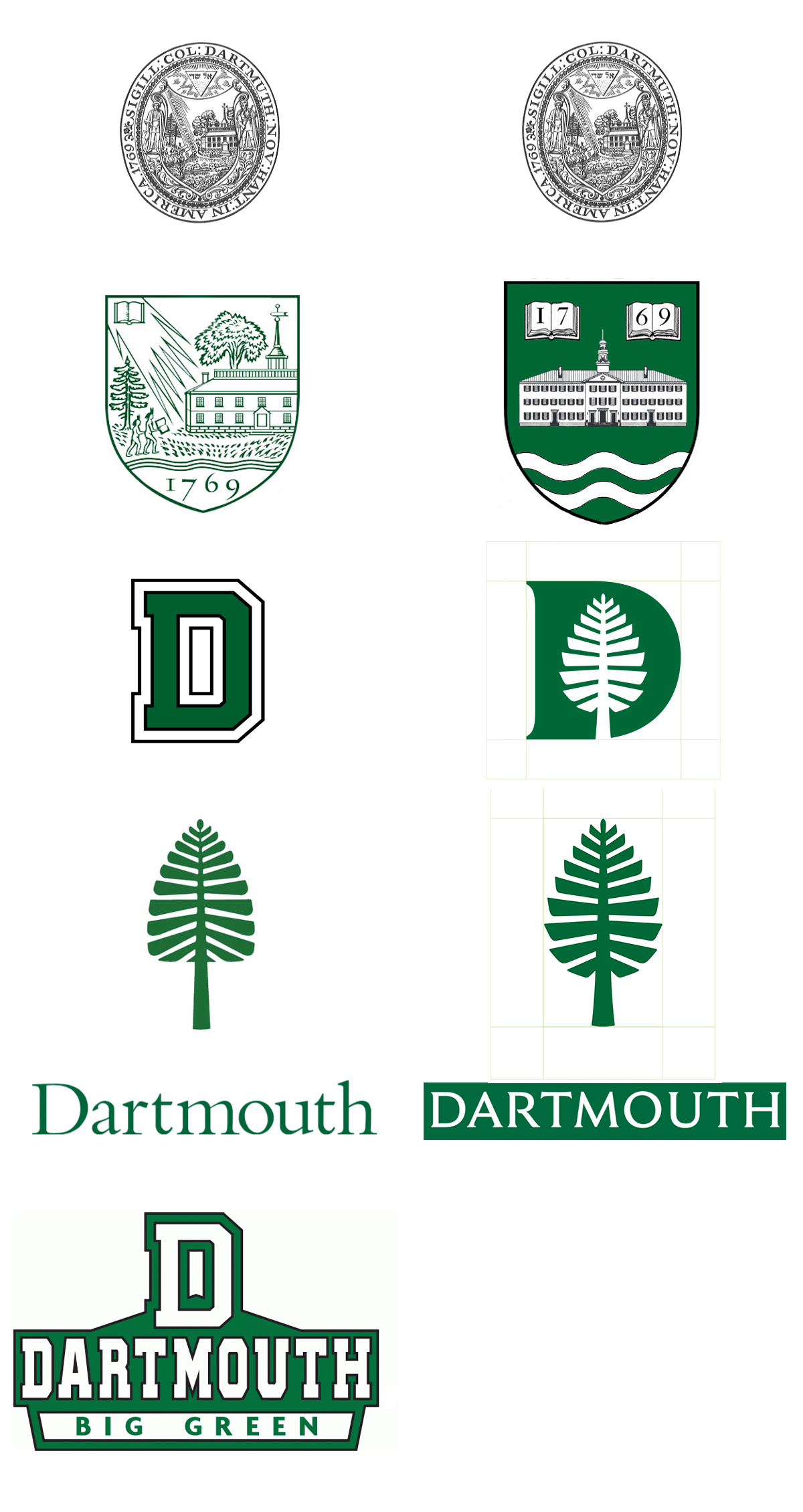
    The new graphic elements include four key items: a Dartmouth wordmark, which is the typographic treatment of the Dartmouth name; a custom-made typeface; a redesigned “lone pine”; and an icon that combines the lone pine with the letter D. Additionally, there is a new palette of colors to complement the traditional Dartmouth Green color, as well as new icons for use in social media, all of which will better communicate the Dartmouth identity, says Anderson.

    The typeface is by Jesse Ragan (creator of RudolphRuzicka.com) and is based on the type that Ruzicka designed for use on the Bicentennial plaque, in the Zahm Garden outside Paddock Music Library), and the later Dartmouth Medal. (It is not to be confused with Dartmouth’s other 1969 typeface, the one that was designed by Will Carter and Paul Hayden Duensing and was revived recently for the Inn’s own rebranding.)

    Like the typeface, the “D-Pine” mark is a nostalgic call to the early 1970s. It has a pleasing retro-kitsch character and makes one think of orange down vests, canned beer, and what are now called trucker hats. It would make an excellent athletics mark.

    The use of the Versailles-like map of the paths on the Green as one of the four suggested patterns picks up an idea from the Year of the Arts (style guide).

    And now we have an explanation of the origin of the seal-like House emblems (post, post): “The firm [OCD] also worked with the house communities last year to design a set of [insignia] with a unified design language, which debuted last fall, Anderson said.”

    —–

    [Update 02.18.2018:]

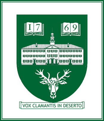
    It’s true that the D-Pine, as fine as it might be, does not make an adequate replacement for Dartmouth’s midcentury shield. Perhaps the chart should look something like this?

    Adopting a new coat of arms as a part of the 250th anniversary

    This is an edited version of a post of seven years ago.


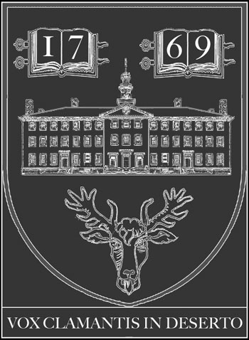
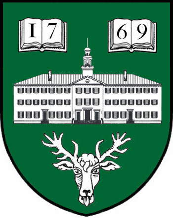
    Jonathan Good wrote a proposal for a heraldic coat of arms for Dartmouth College in 1995. As the proposal explains, the new symbol would be an adjunct to the existing coat of arms rather than a replacement for it.

    The celebration of Dartmouth’s 250th anniversary in 2019 would be a fine time to adopt the coat of arms. At the last big college celebration of this kind, the 1969 bicentennial, the school adopted the lone pine device that has since become widespread.

    A couple of Scott Meacham’s own cut-and-paste efforts to render the proposed arms:

    Proposed arms for Dartmouth as designed by Good and depicted by Meacham

    Proposed arms for Dartmouth as designed by Good and depicted by Meacham

    Moosilauke Ravine Lodge construction continues

    • David Kotz has some nice photos of the construction of the new Ravine Lodge.

    • The Rauner Library Blog has a post on the great railroad artist Howard Fogg ’38.

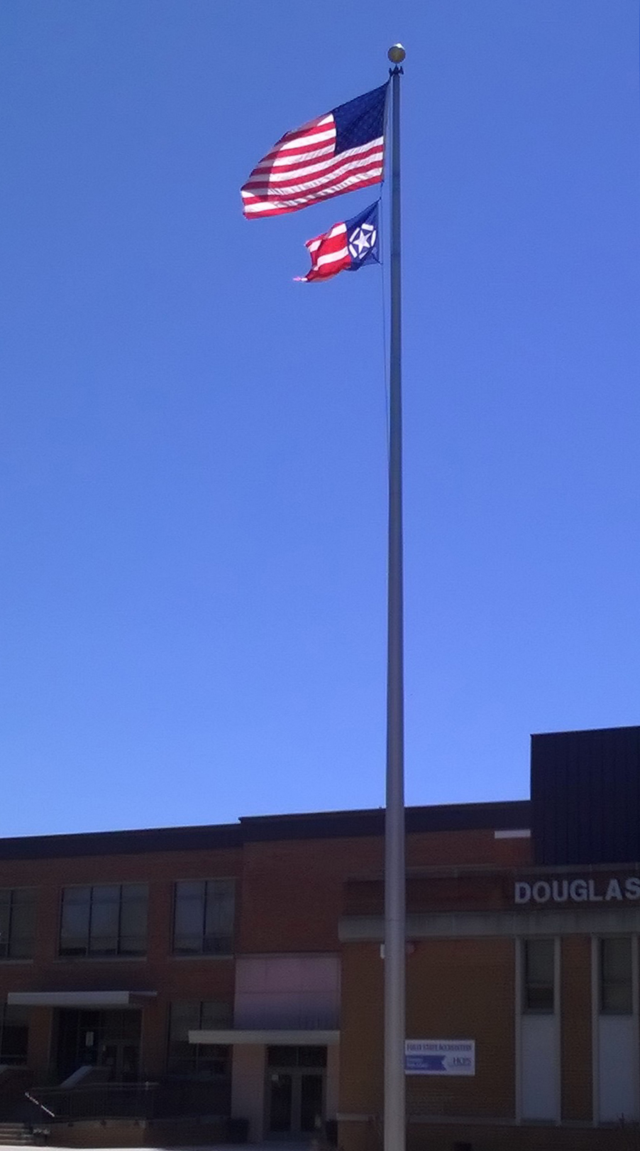
    • Spotted this flag at a Richmond, Virginia, area high school:

      Photo of flag at Freeman High, Richmond VA by Meacham

      The star recalls the WWII Army Air Force insignia or the Chrysler Pentastar of the Eighties. Or it could be a battlefield map depicting a star fort surrounded by infantry units. The variety of bar widths is unusual. Flags of the World explains that it is “an official symbol of remembrance of September 11th” and that when it is hoisted vertically, the wide bars are meant to be seen as the Twin Towers.

      It turns out that the flag’s designer owns a restaurant very close to the school, and that he has also designed a monument to the flag (in the shape of the flag, hoisted vertically) for a traffic island nearby. “Given that it is the home of the Freedom Flag, Henrico County is the natural choice for the location of the Freedom Flag Monument and Virginia 9/11 Memorial.”

    • Dartmouth Now seems to have changed its name to Dartmouth News.

    • Other college buildings based on Independence Hall are found at Brooklyn College:


      and Westminster Choir College in Princeton, N.J. (see the Google Earth 3D image).

    • Amherst has chosen as its mascot the Mammoth. The blurb explaining the Mammoth proposal notes that “The Beneski Museum of Natural History famously displays the skeleton of a Columbian mammoth, unearthed by Professor Frederick Brewster Loomis and brought to the College in 1925.” Museum specimens always provide good mascot options. Dartmouth’s museum displayed both a stuffed zebra and a set of curious elephant (i.e. mammoth) bones during the late eighteenth century.

    • The University of Virginia is celebrating its 200th anniversary and will feature bicentennial-logo zipper pulls on this year’s graduation gowns.

    • The city of Krakow has a new logo in the form of a city plan.

    • Last year the New York Times published interactive articles on mapping the shadows of New York and which existing Manhattan buildings could not be built today.

    • A Times obituary of March 13 noted the passing of the architectural historian and author of the Streetscapes column Christopher Gray. I was never able to meet him, but I was honored to have my site mentioned in his column on Lamb & Rich, and I enjoyed visiting the Office for Metropolitan History to do research in his compilations of 19th-century Times building permit notices (now they are in an online database provided by OMH, an amazing resource). The New Yorker ran an article about how Gray had left his skeleton to his school, St. Paul’s. What a character —

    250th anniversary planning heats up

    • One might be surprised at paucity of info out there on the demolition of a part of the Hood Museum and the construction of a large addition. The D has a demolition photo from the Green taken last fall. Curbed.com has a post with two post-demolition photos. (See also the set of fascinating photos of the architectural model at Radii Inc.)

    • Metropolis does have a story on the Hood. These are excerpts:

      Dartmouth first began seriously mulling over the Hood’s fate in 2001, when it commissioned a speculative study by Rogers Marvel Architects. In 2005, it commissioned another by Machado Silvetti, the architectural firm that designed the Hood’s newest neighbor, the Black Family Visual Arts Center. Then in 2010, it commissioned yet another study, this time by Centerbrook, the practice that Charles Moore cofounded afterparticipatory process, which put users on a level playing field Moore Grover Harper. None created the visual presence — that new front door — that Dartmouth administrators were looking for.

      The college began soliciting proposals from a broader pool of architects. A selection committee, including faculty and administrators, winnowed down a short list. In the end, four architects were selected to be interviewed. John Scherding, director of campus design and construction, vividly remembers the TWBTA proposal:

      “All of us in the room felt it was brilliant. They were the only firm that suggested disconnecting the Hood from Wilson Hall, allowing Wilson to stand proudly on the corner of the Green. They were the only firm that showed a strong identifiable front entrance to the building, infilled the courtyard to provide program space, and really strengthened the north-south axis. It was a very powerful and simple concept that satisfied all of the needs.”

      It thoughtfully preserves the gallery spaces (one exemplary detail: To preserve the windows along the staircase, and the dance of light along the walls, TWBTA will convert some of the windows into light boxes of stained glass) and will likely improve the museum experience in many fundamental ways.

    • The sestercentennial celebration website is up. The wordmark makes some interesting typeface choices. The unique “250,” which is set in a type that might be based on Bodoni, includes the most arresting element: a numeral “2” whose diagonal (neck?) is partially erased. The numeral “5” is partially hidden by the “2,” but there is no explanation for the missing bit of the “2.” Is it meant to look like the imperfect printing of an eighteenth-century pamphlet? It looks a bit like a stencil. In any case, the “Dartmouth” on the second line is set in the official Bembo (standard Bembo, not the Yale-only version), and the third line (“1769-2019”) is set in a sans serif font.

    • The sestercentennial will involve a year-long program of events (President’s message) created by a planning committee seeking to meet a number of goals.

    • Here’s a clever little film about an interesting story: Goudy & Syracuse: The Tale of a Typeface Found.

    • Interesting insignia decisions here: the midcentury Institute of International Studies in California was acquired a few years ago by Middlebury College (Wikipedia). In 2015, Middlebury “introduced a brand identity system that embraces the full breadth of its educational endeavors by placing the Middlebury name on each of its schools and programs” (MIIS page). And what a varied collection of institutions it is, including summer schools, conferences, and academic programs. The unified identity is based on a shield. I don’t know about the Midd shield: the globe looks like it’s from a different design language, from a 1960s U.N. brochure. The chapel touches the top of the shield. The hills, because they meet the edges of the shield, read as the sleeves of a gown or as curtains. Maybe this is because the eaves of the chapel are shown as angled bars floating free on the clouds.

    • The Institute is the only Middlebury institution that gets a truly distinctive shield, a variation “that replaces the Green Mountains of Vermont and Old Chapel with the historic Segal Building from the Monterey campus and the year of the Institute’s founding” (MIIS page).

    • A Kickstarter project for Design Canada, “The first documentary chronicling the history of Canadian graphic design and how it shaped a nation and its people.”

    • The New Yorker has has an article on lines of desire. Speaking of unplanned paths, the aerial photo of the vacated pipeline protest camp in the New York Times is remarkable.

    • McGraw Bagnoli Architects have published a brochure about the firm that details the five urban design projects planned by William Rawn Associates during the early 2000s. This is fascinating. It will be interesting to see whether the school ever completes the Sargent Block project and what plan it follows.

    • Smith & Vansant have photos of some of the houses the firm has renovated for the college, including Unity House and Thayer Lodge, both on South Park Street, 26 East Wheelock, 19 South Park, and the Victorian professor’s house of the North Park House community.

    • Architect Vital Albuquerque (again, great name) < ahref="http://rwu.edu/academics/schools-colleges/saahp/portfolios/alumni/vital-albuquerque-class-01">presents more unreleased renderings of the unbuilt NCAC, including a remarkable photo of a model of the project.

    • Engelberth Construction has its page for the West Stand Replacement up.

    • At the last board meeting,

      Hanlon outlined goals to renovate a number of aging buildings, and the board approved funds to proceed with a schematic design for the renovation of Dana Hall, the former home of the biomedical library located at the north end of campus, to facilitate the expansion and improvement of faculty office spaces.

      The board also approved a capital budget of $30 million to fund a number of projects, including the Morton Hall renovation and planning and feasibility studies of the abatement and demolition of Gilman Hall; renovations to Reed Hall and Thornton Hall; and undergraduate housing expansion and renewal.

    • A Moosilauke update with photos by Eli Burakian. The building has an interesting mix of construction techniques. Some of those “character” timbers are fantastic.

    • Some of the photos of the federal building that houses the Ninth Circuit Court of Appeals, such as the one in this New York Times story from February 9, show the elaborate metal lanterns flanking the entrance of the 1905 building. The lanterns might be familiar: architect James Knox Taylor, then Supervising Architect of the Treasury, modeled them on the torch-holders of Palazzo Strozzi in Florence of 1489 (GSA page on the Browning U.S. Court of Appeals Building). The Strozzi torch-holders also inspired Charles Rich in his design for Parkhurst Hall (1913).

    • Drove past Nervi’s SCOPE arena in Norfolk, Va. (1971-72) last weekend and admired the ribs that form the roof of this entrance pavilion (Google Street View):

    A Thayer garage on Wheelock Street?

    • Planning for the Sestercentennial is starting in earnest (Dartmouth Now).

    • Check out the West Wheelock massing study by UK Architects, part of the gateway district process.

    • The locker rooms in the Sports Pavilion, one of the only buildings on campus that is not named for anyone, are slated for enlargement (Valley News interview with Harry Sheehy).

    • The school has considered expanding Thompson Arena by excavating under the stands (Valley News interview with Harry Sheehy).

    • The Rauner Blog has a post on the centenary of the death of Richard N. Hall.

    • Don’t forget about the 1966 Webcam on the roof of the Inn.

    • The Dartmouth song “Son of a Gun for Beer” would seem to share a history with this song about the Hebron YMCA recorded on a wax cylinder and described as a Harvard song. “A Son of a Gun” with its current arrangement by Crane appeared in the 1898 Dartmouth songbook attributed to an anonymous author1Edwin Osgood Grover and Addison Fletcher Andrews, Dartmouth songs: a new collection of college songs (1898), 60. Historian Patricia Averill connects the song’s origin to the “Itsy Bitsy Spider”! That song originated in 1817 as “The Rambling Soldier” and was published in 1870 referencing a “son of a gambolier.”2Patricia Averill, Camp Songs, Folk Songs (author, 2014), 232 There is an 1891 reference to “A son of a gambolier, / A son of a gun for beer.”3Henry Collins, “Notes from an Engineers’ Camp,” Lippincott’s Monthly Magazine (September 1891), 374, available at Google Books. Georgia Tech’s “Rambling Wreck” version was printed in 1908.4Averill.

    • Thayer School is thinking of putting a parking garage on West Wheelock Street in place (presumably) of the college-owned apartment buildings there (Planning Board minutes 17 November 2015 pdf). Interesting!

    • Neat topics that are covered in Wikipedia: moonlight towers, low-background steel, Manhattanhenge, ghost stations, trap streets and other fictitious entries (copyright traps), and freedom of the city.

    • In the discussions of Dartmouth’s Lone Pine let’s not forget another piece of stylized vegetation from the Sixties: the flag of Canada.

    • Details on the Baker Tower renovation (Planning Board minutes 3 November 2015 pdf):

      The project includes: replacing the roof, restoring windows, replacing clock
      controls/hands/glass, replacing lighting and addressing issues with lighting, installing electronic controls for the bells, replacing the spire, stopping water infiltration, and cleaning masonry grout.

    ———

    References
    1 Edwin Osgood Grover and Addison Fletcher Andrews, Dartmouth songs: a new collection of college songs (1898), 60.
    2 Patricia Averill, Camp Songs, Folk Songs (author, 2014), 232
    3 Henry Collins, “Notes from an Engineers’ Camp,” Lippincott’s Monthly Magazine (September 1891), 374, available at Google Books.
    4 Averill.

    Moosilauke demo official; other items

    • Dartmouth Now reports in “House Professors Named to Residential Communities“:

      The house professors will each serve a four-year term beginning July 1, 2015, and will move into on-campus residences near their respective house communities the following summer.

      In fact, other than the current East Wheelock professor, who will continue, none of the professors has been publicly named to a particular residential community. See also The Dartmouth.

    • A new sport to try: the primitive biathlon (a href=”http://www.vnews.com/home/16288958-95/a-snowback-throwback-biathlons-receive-a-retro-makeover”>Valley News).

    • The Food Co-Op has posted a video of the renovation and addition project as it stood in March.

    • The Rauner Library Blog has a post on the remarkable collections of digital photos that are coming on line. Among the topical Photo Files:

      As of this post, approximately 34,000 images representing topics through “Lacrosse, Womens” are available.

    • Charles Gibson Design did print design and logo and stationery for the Lebanon landscape architecture firm of Saucier & Flynn.

    • The Dartmouth reports that the trustees have finally decided to replace both the Moosilauke Ravine Lodge and the Ledyard Canoe Club clubhouse. Although the article uses the word “rebuild” several times, the buildings are not going to be carefully dismantled and put back together like the Ise Jingu grand shrine (Smithsonian mag), and they will not be replaced with replicas as Dartmouth Hall was. Each one will be demolished and have a novel building designed by Maclay Architects put up in its place. Given the past work of that firm and collaborator TimberHomes LLC, the timber-framing company co-founded by D.O.C. historian David Hooke, the results should be excellent. Built of posts and beams instead of stacked logs, a new Ravine Lodge could really be “an unlikely cathedral,” as the film calls it.

    • Dartmouth Now reports that the William Jewett Tucker Foundation is splitting into the Dartmouth Center for Service, so named for the time being, and the William Jewett Tucker Center. The endowment funds whose donors are no longer living will be split evenly between the two new foundations.

    • The football team has unveiled its new black uniforms; Big Green Alert has photos.

    • With the 250th anniversary of the charter grant approaching on December 13, 2019, the newly-admitted Class of 2019 is being called the Anniversary Class (see The Dartmouth).

      Google Maps; other topics


      Google’s latest (July 2013) Street View of the SoWhee complex: interesting sky.

      • The British Pathe Archive has a 1935 newsreel called “Tricks on Skis” that shows some early extreme skiing (or “scheeing,” as the announcer says it) at Dartmouth. A film about the 1939 Carnival shows Dick Durrance winning the slalom.

        The archive also has a fascinating pre-1920 silent film of an unidentified Maori rugby team performing a haka. All of Wikipedia’s examples of U.S. teams with a haka tradition involve gridiron football rather than rugby.

      • Post-VAC, the art studios in the Hop have been renamed the Hop Garage and Loew’s has been renamed the Hood Auditorium.

      • Oudens Ello has photos of the Collis renovation.

      • As part of Brown’s 250th anniversary celebration, Brown’s museum (in the amazing Doric Manning Hall) is presenting an exhibit titled “In Deo Speramus: The Symbols and Ceremonies of Brown University” through October 2015. The exhibit sounds worthy of being made a permanent one. Dartmouth should have a permanent one too — a permanent presentation of a history of the college and place where significant objects are kept. Part of the space can be devoted to the changing exhibits that now appear in the College History Room, which is really more of an Alcove.

      • Back in March the cover story in the DAM was a history of Dartmouth in fifty objects. The text notes that the College Usher, “usually the dean of libraries,” has carried Lord Dartmouth’s Cup at Commencement since 1983. That is an interesting (E.C. Lathem?) innovation, since the cup has been at the college since 1969; its use in the procession definitely removes any need for a mace. And let this post serve as a further encouragement of the revival of any other unfilled charter offices in time for 2019. The charter authorizes the trustees to “from time to time as occasion shall require elect constitute & appoint a TREASURER a CLERK an USHER & a Steward.”

      • By the way, the Alumni Magazine has announced that it’s going to have every issue on line soon, back to No. 1 in 1908.

      • Google Maps now let you see Street Views back in time (C|Net, Google Lat Long). In Hanover, the McLean ESC appears with and without the penthouse addition as you toggle between October 2010 and July 2013. Some places have three or four generations of imagery: at 8 Occom Ridge you can see a real turn-of-the-century Arts and Crafts house get replaced. On Webster Avenue you can see the original Sig Ep house, then the current house under construction, then the finished product. And let’s not forget Alpha Phi, replacing Larson’s faculty apartments.

      • Google Maps also lets you rotate aerial views now. The new perspective makes a place seem foreign: what’s this zig-zaggy campus tucked into a neighborhood of nice houses?

      • Much will change in the Sargent Block (Bing aerial), possibly starting during 2015. Naturally the Beyer Blinder Belle master plan (post) shows the block transformed.

      • Naming: NATO’s practice of assigning a reporting name to each type of Soviet aircraft (Bear, Foxbat) is familiar, but NATO also has named a U.S.-built aircraft, the P-63 Kingcobra. It was called Fred.

      • Archeology for fun: the unsold Atari cartridges for the E.T. video game have been found in a New Mexico landfill where they were dumped in 1983 (Kotaku.com, Wikipedia).

      • The Valley News story on the success of the equestrian team states that although the team once was the province

        of the Dean of the College and the Dartmouth Outing Club, equestrian moved over to the college’s athletic department three years ago.


      Dig the buttressing on the brick screening wall behind the Life Sciences Center.

      —–

      [Update 05.18.2014: I must have read this but forgotten the details. From Edward Connery Lathem’s 2009 memorial:

      Mr. Lathem’s having in 1983 pointed out that Dartmouth’s royal charter of 1769 provides for inclusion among the institution’s officers of an usher, as well as a steward, caused the college’s board of trustees to reinstitute both of those long-dormant posts, and he from that point onward served as college usher, functioning as such within the ceremonial pagentry of annual convocation and commencement exercises.

      I hope the steward’s present obscurity does not mean that the office goes unfilled.]

      New surgical wing; other topics

      • The college recently unveiled a plaque announcing the Orozco Frescoes’ status as a National Historic Landmark (Dartmouth Now). No images yet.

      • Dartmouth Engineer has a story on the new Center for Surgical Innovation. This addition to DHMC is one of the few parts of the complex not designed by SBRA (post).

      • A Kendal news release on master planning refers to the acquisition of the Chieftain. A future expansion of the retirement center could make a neat feature out of the Chieftain’s rowing dock.

      • The New York Times has a story on the planned demolition of the Folk Art Museum to make way for an expansion of MOMA next door. (The architects of the Folk Art Museum, Tod Williams and Billie Tsien, are designing an expansion of Dartmouth’s Hood Museum that preserves and reuses Wilson Hall next door.)

      • Enjoy the retro poster (via Big Green Alert Daily) for round one of the Varsity Cup rugby tournament, held at the Rugby Clubhouse. Dartmouth won the match.

      • CurbedNY has a bit on the Guastavino family. The one grandly-scaled Guastavino-tiled space at Dartmouth, the surgical theatre at the old hospital, no longer exists, but the firm’s vault in the hospital’s one surviving wing remains on Rope Ferry Road. Also check out the entry vestibule of McNutt Hall, likely a Guastavino structure (post).

      • UPNE is listing a publication of a partner called Voice of the Åland Churches by Åsa Ringbom. How about that. Åland (Wikipedia) is an autonomous island province of Finland located in the Baltic partway to Sweden. It has its own stamps and a striking flag that reflect its largely Swedish ethnicity.

      • Dartmouth needs to name at least one building for the building’s architect. This is not an uncommon practice, although only one example comes to mind, the Norman Shaw Buildings at Parliament in London (Wikipedia; W&M’s main building was not designed by Christopher Wren). The designers who need recognition at Dartmouth are Charles A. Rich and Jens F. Larson. The bulk of the campus was created by these two College Architects in succession between about 1895 and 1939. The one building on which both architects did extensive work is the Heating Plant, which Rich built as a one-story building and Larson raised by one story. Maybe when the Heating Plant is taken over by the college museum, these artists can be credited and the building can be known as the Rich-Larson Wing of the Hood Museum of Art.

      • Brown started up its 250th anniversary celebration last month. Dartmouth’s ex-president Jim Yong Kim, a 1982 Brown graduate, gave a lecture at the Opening Celebration. The “Traditions” section of the 250th website explains that Brown chose the brown bear as its mascot in 1904 and in 1905 brought a live bear to a football game — the Dartmouth game — for the first time. Dartmouth won. (Brown doesn’t call the anniversary a “quartomillenium” or “sestercentenary” but a “semiquincentenary.”)

      • DUSA (Dartmouth Uniformed Service Alumni) has an informative page devoted to its symbols. As is traditional, the shield has the wavy lines representing the Connecticut River in the base. One wonders whether every organization, including the college, would benefit from depicting the River as a set of wavy bars thick enough to have their own colors, perhaps blue or even white (alternating with the green color of the field).

      • Interface: News and Information from Dartmouth Computing Services is back. One might recall the nice paper magazine iteration of Interface from the late 1990s.

      • The football team will wear an alternate helmet design at some point this fall, notes Tris Wykes in the Valley News. Perhaps influenced by trends in cars (Financial Times, Autoweek) or the Pro-Tec helmets worn by skateboarders or special operators, matte black seems to be gaining popularity in football. Examples are found at Cincinnati and Oregon; Missouri seems to have been an early proponent in 2009 with its Nike Pro Combat uniform (see Uniform Critics).

      —–

      Update 05.22.2014: Banwell architect Ingrid Nichols’s resume (pdf) states:

      Banwell has joined forces with a national Kendal design architect, RLPS and together are completing a master plan for a new 20 acre abutting parcel they have recently purchased. We are also completing a master plan for their existing campus including: Additions for independent living, nursing, health center, fitness center (pool, locker rooms, exercise rooms and activity room).

      Ideas for the visual identity guidelines


      If you’re working on the branding effort (see the previous post on the topic), I would recommend a visit to the archives to see some things:

      • The green ribbon and its story. The college is represented by a single color.
      • Typical accent colors are black, lavender, and white. White is used frequently in athletics. No big green-and-gold tradition seems to exist.
      • The seal and its history. More effort could be devoted to reserving the seal for official uses only.
      • The midcentury shield now in use, and the recent proposal for an heraldic coat of arms.
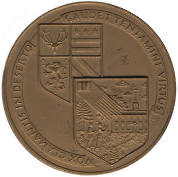
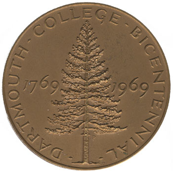
      • The Bicentennial medal designed by Rudolph Ruzicka.
      • Anything designed by John Scotford.
      • Anything produced by the Stinehour Press (photo of exhibit, Valley News story) or Ray Nash, of the Graphic Arts Workshop (Rauner bio); also books published by the Dartmouth College Press.
      • Copies of the ORC from various periods.
      • Copies of The Dartmouth from various periods, especially before WWII.
      • Carnival posters, especially those produced before 1959.
      • Things made of leather and wood: Daniel Webster’s water bucket and old ski boots, senior canes and snowshoes.

      version of proposed coat arms

      Around campus, you might take note of the white color of Dartmouth Hall and the finely-speckled gray/white of the granite used in the foundations of many buildings. (That granite is not likely to be local; for a local granite, see the pinkish stone of Rollins Chapel, a stone that has not been used very widely on campus.) The brick walls with their varied colors, from black to brown to red, are characteristic of the campus, although the style of brickwork was originally called “Harvard brick.” There are many useful greens, including the patina of the copper roofs, the paint used on building shutters, the color of the shaggy pines along the riverbank, and the sometimes-black color of the river itself. An example of lavender appears in the glass of the Baker Tower clock.

      medal reverse   medal obverse

      A list of style guides from Logo Design Love has some nice examples. Duke’s guide announces that the word “University” in the Duke wordmark is set in Interstate, the typeface developed for road signs by the Department of Transportation. Yale’s identity site is prepared by the Office of the University Printer rather than the PR office. Princeton’s guide (pdf) on page 21 explains the difference between the seal and the shield, and it goes so far as to deface the seal with the word “SAMPLE” since, as the text explains, the seal is not for the public — not even by way of example! (Unlike B.U.) Oxford’s logo page has great visual appeal and actually is fairly flexible in its rules. University College Oxford has a guide by Franks and Franks (portfolio example) that looks nice and builds a traditionalist logotype around an abbreviation and nickname (“Univ.”).

      —–
      [Update 05.03.2014: Broken link to Princeton guidelines replaced; point about “SAMPLE” no longer valid.]

      MMXIX

      The website for the current strategic planning process uses the 2019 Quartomillenium as an endpoint, with its motto “Imagine the Next 250.”

      The Bicentennial year of 1969-1970 gives an example of what the Quartomillenium could be. There were three big events according to Charles Widmeyer in John Sloan Dickey: A Chronicle of His Presidency of Dartmouth College (1991), 250, 271. Those events were:

      1. The Bicentennial Commencement in the summer of 1969.
      2. Dartmouth Day (i.e. Charter Day), December 13, 1969. This was the focal point of the year, and it involved a fireworks display, a parade around the Green, and a proclamation by the Governor in front of the Hop (the Bicentennial plaque is in the Zahm Garden).
      3. The Third Century Convocation in the Fall of 1970.

      The notable commemorative objects produced for the Bicentennial included:

      1. A USPS stamp designed by John Scotford, technically in commemoration of the 150th anniversary of the Dartmouth College Case, since USPS does not recognize individual schools or their anniversaries.
      2. A new college flag with its stylized pine symbol designed by Scotford.
      3. A medal designed by Rudolph Ruzicka and struck by the U.S. Mint at Philadelphia, requiring an act of Congress:

      dartmouth medal

      dartmouth medal

      The Quartomillenium could include these events:

      1. A commemoration of the Bicentennial of the Dartmouth College Case.
      2. A visit by the 10th Earl of Dartmouth.
      3. The receipt from the College of Arms of letters patent granting to Dartmouth an honorary coat of arms along these lines:

      proposed arms

      Brand identity topics

      I. The Dartmouth Company

      Curiously, there is a Boston-based real estate company called The Dartmouth Company. It makes good use of serifs and a dark green color on its website and seems to operate in New Hampshire. See also the more obvious reference to the college at the Dartmouth Education Foundation.

      II. The Arms of Dartmouth’s Schools

      The Dartmouth College website seems to be doing something new when it describes the institution as a collection of five apparently equal schools:

      shields from webpage

      Excerpt from college website.

      The harmonization and use of the schools’ shields is commendable.

      But this arrangement seems to contradict the rule that Dartmouth is the college. The “Associated Schools” — Tuck, Thayer, Medical, and lately the graduate programs — are associated with the college but are not coequals beneath a central university administration. Because “Dartmouth” is the undergraduate college, there is no need to put the letters “CA&S” before one’s class year, for example.

      Tom Owen writes in The Dartmouth today:

      In the discussion following Kim’s address, Provost Carol Folt said there is a “complicated set of reasons” for the gap between Dartmouth’s national and international rankings. Two of the major contributing factors are Dartmouth’s lack of a “university” title and Dartmouth’s focus on undergraduates, both of which have hurt Dartmouth’s international reputation.

      […]

      Although large-scale changes may be necessary in the next decade, alumni must see new developments as part of an institutional history of adaptation rather than as a threat to tradition, Kim said.

      The school’s Quartomillennium celebration in 2019 would be a good time to launch something new.

      [01.25.2012 update: Education Foundation link added.]

      The Dartmouth Arms

      Jonathan Good wrote a proposal for a heraldic coat of arms for Dartmouth College in 1995. This website has linked to Good’s pamphlet at several locations over the years and is happy to host it once again.


      As the proposal explains, the new symbol would be an adjunct to the existing coat of arms rather than a replacement for it.

      The celebration of Dartmouth’s 250th anniversary in 2019 would be a fine time to adopt the coat of arms. At the last big college celebration of this kind, the 1969 bicentennial, the school adopted the lone pine device that has since become widespread.

      The school might even petition the College of Arms for a grant of honorary arms, as has been done by George Washington University and Hampden-Sydney College.

      A few of Scott Meacham’s own cut-and-paste efforts to render the proposed arms:

      Proposed arms for Dartmouth as designed by Good and depicted by Meacham

      Proposed arms for Dartmouth as designed by Good and depicted by Meacham

      Proposed arms for Dartmouth as designed by Good and depicted by Meacham

      —–
      [Update 11.17.2012: Broken link to HSC page fixed.]
      [Update 11.30.2010: GWU link corrected.]