The college has revealed its new branding strategy (pdf), devised by Original Champions of Design (see news from the Office of Communications, Dartmouth News, The Dartmouth, and Brand New).
The strategy is the largest part of a new identity push that is described in “Telling Our Story” (pdf).
The new identity replaces the mild revamp described in the 2014 brand style guide (pdf). A September 2016 tweet by OCD at Rauner gave a hint that something was up and shows the depth of the firm’s interest in history. (And it’s possible that the image of the commemorative tile on page 50 came from this post; see also this 2013 post encouraging the mining of college history.)
From Dartmouth News:
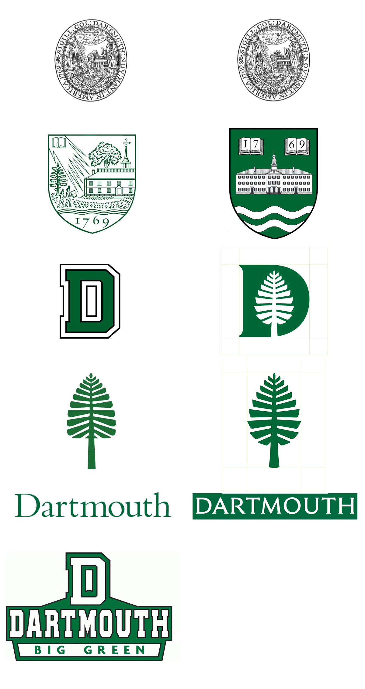
The new graphic elements include four key items: a Dartmouth wordmark, which is the typographic treatment of the Dartmouth name; a custom-made typeface; a redesigned “lone pine”; and an icon that combines the lone pine with the letter D. Additionally, there is a new palette of colors to complement the traditional Dartmouth Green color, as well as new icons for use in social media, all of which will better communicate the Dartmouth identity, says Anderson.
The typeface is by Jesse Ragan (creator of RudolphRuzicka.com) and is based on the type that Ruzicka designed for use on the Bicentennial plaque, in the Zahm Garden outside Paddock Music Library), and the later Dartmouth Medal. (It is not to be confused with Dartmouth’s other 1969 typeface, the one that was designed by Will Carter and Paul Hayden Duensing and was revived recently for the Inn’s own rebranding.)
Like the typeface, the “D-Pine” mark is a nostalgic call to the early 1970s. It has a pleasing retro-kitsch character and makes one think of orange down vests, canned beer, and what are now called trucker hats. It would make an excellent athletics mark.
The use of the Versailles-like map of the paths on the Green as one of the four suggested patterns picks up an idea from the Year of the Arts (style guide).
And now we have an explanation of the origin of the seal-like House emblems (post, post): “The firm [OCD] also worked with the house communities last year to design a set of [insignia] with a unified design language, which debuted last fall, Anderson said.”
—–
[Update 02.18.2018:]
It’s true that the D-Pine, as fine as it might be, does not make an adequate replacement for Dartmouth’s midcentury shield. Perhaps the chart should look something like this?