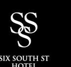
Speaking of graphic design, the new hotel on South Street (behind Hanover Park, where Panda House used to be) has been named Six South Street and has been given a logo by Vreeland Marketing & Design.

Detail of logo
While the hotel is to be welcomed and its builders admired for their boldness and attention to urban design, the logo deserves some criticism:
The word “Street” really should be written out. While “South St.” might be part of an address, the thoroughfare that gives its name to the hotel is “South Street.” The word “Six” seems to have been spelled out to add formality or pretense, the way it is in “The Wall Street Inn” (not the plain-old “Wall St. Inn”). So the word “Street” should be as well. Only an address plaque on the building should read “6 South St.” After all, both “Six” and “South” have shorter versions that could have been used but weren’t. And even though “Hotel” is on its own line, it still makes the logo seem to refer to a “Saint Hotel” (“St. Hotel”).
When a word is abbreviated, it requires a period. Probably to prevent the letters “ST” from appearing to retreat from the righthand edge, the logo omits the period. This should have been solved some other way.
—–
[Update 12.02.2012: Broken link to MCHG image removed.]
[Update 11.17.2012: Broken link to Vreeland fixed, two broken links to MCHG removed.]