The library had a contest to select a design for its new favicon/logo, formerly the tilted D. The winners (pdf) are surprisingly heraldic.
This might have been mentioned before, but the staff in the DMS shield has been genericized. It used to be an Indian-head cane.
Dartmouth has its own typeface, or at least the capital letters for a typeface, writes the Rauner blog. Will Carter designed Dartmouth title (Rauner’s sample) around 1969 for use in inscriptions in the teak panels in the Hopkins Center. The present king of collegiate typefaces seems to be Matthew Carter’s ca. 2008 Yale (see also Yale Daily News article), although Frederic Goudy’s 1938 University Old Style for Berkeley is an earlier example that lives on in Richard Beatty’s 1994 redrawing as UC Berkeley Old Style.
For years, Smith College tapped into certain associations (unintentionally?) by using ITC Garamond, which paralleled the Apple Garamond of Apple Computer advertisements at the time (Wikipedia on Apple typography; Smith’s current Visual Identity Program). The quality of the design itself is important, and distinctiveness is not everything (see the Typotheque article on the modification of Brioni for Al Gore).
With the Visual Arts Center about to go up next door to the Hopkins Center, it’s time to finally commission an artist (Colossal Media, say) to paint signs on the Hop’s largely-blank rear walls. The walls of Spaulding Auditorium (Street View) and the huge fly loft at the rear of the Moore Theater are ripe for advertisement.
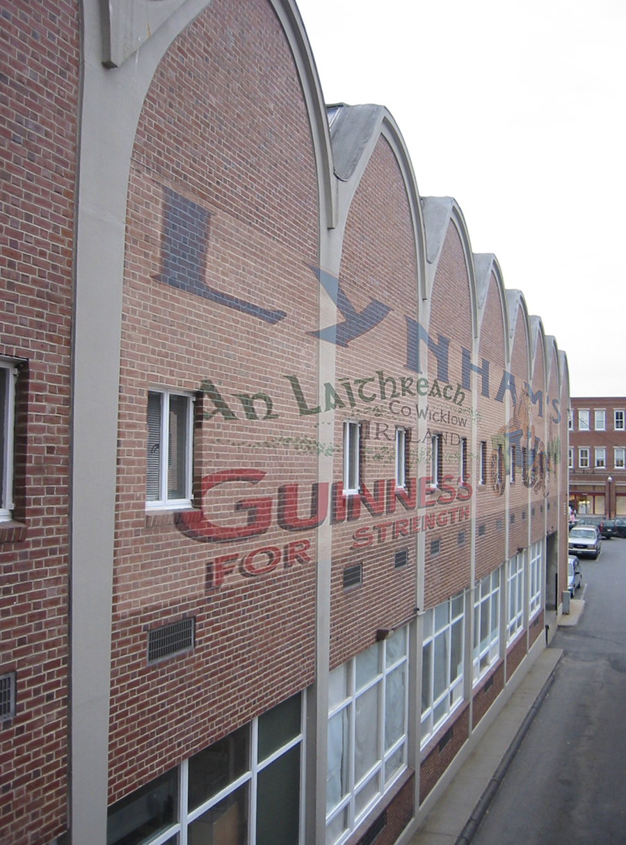
Sign concept for west facade of studio row, Hopkins Center (partially based on a photo from http://philip.greenspun.com).
The destruction of a genuine ghost sign at the unique industrial/commercial campus of the University of Washington, Tacoma recently caused some controversy (News Tribune).
—–
[Update 11.17.2012: Broken link to Smith program fixed.]