Heraldica

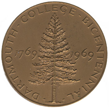
1. The Lone Pine really is taking over from the 1940s-1950s shield as an emblem of official college-related things other than the board of trustees.

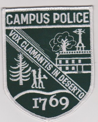
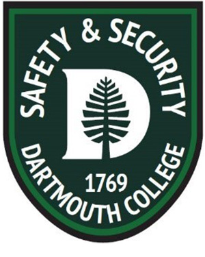
The pine is everywhere. For example, the Campus Police were represented by this patch but now Safety & Security are using this one. A van from Computing Services (now called ITS?) features a pine dissolving into pixels. Each of the new shields of Thayer School and Grad Studies has a pine. The new-ish DDS logo presents the Lone Pine as a giant piece of broccoli. Peak magazine (Winter 2015) even has an article on the phenomenon.

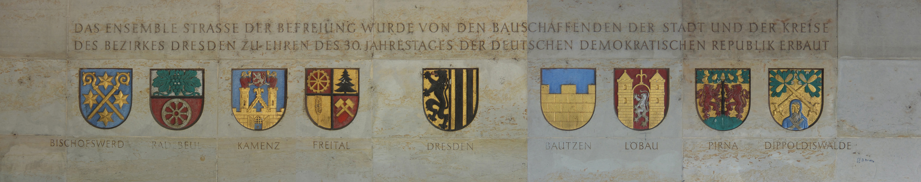
2. If the residential colleges adopt coats of arms, the collection of all six will look neat together. Here’s a collaged image of the carved and painted arms of the city of Dresden, flanked by those of the city’s districts, created to honor the 30th anniversary of the establishment of the DDR in 1979:

Dresden, Germany arms. Meacham photo

3. This is not directly related, but it’s worth remembering that a portion of the money that Wheelock used to establish Dartmouth came from Merton College, Oxford (Wiki; arms shown on 1264 Society page). The college is listed as having donated £2.2s.- to Moor’s Charity School during Occom’s and Whitaker’s 1766-1767 fundraising tour of England and Scotland (appendix to Wheelock’s 1769 Narrative in Google Books).

——–

Update 08.25.2015: Take a look at the Flag Project at the Florianopolis Design Biennale — a whole series of flags, each one representing the architectural features of a particular building.

The Houses and retroactive alumnification

A new deanship under an old name — Dean of the College — now oversees the creation of the house system.1Priya Ramaiah, “Rebecca Biron Appointed Dean of the College,” The Dartmouth (26 June 2015), available at http://thedartmouth.com/2015/06/26/rebecca-biron-appointed-dean-of-the-college/ (viewed 1 July 2015).

One of the new House Professors, Ryan Hickox, said recently:

In addition to the House Professors, House members will also include faculty, postdocs, graduate students, staff, alumni, and other associates of Dartmouth, so that the Houses become a true cross-section of Dartmouth in which we all take part in activities and traditions together.2Ryan Hickox, interviewed by Kush S. Desai in “Inside the Mind of a House Professor,” The Dartmouth Review (12 June 2015), at http://www.dartreview.com/in-the-mind-of-a-housing-professor/ (viewed 1 July 2015).

All kinds of interesting questions for the new Dean are popping up:

  • What will the Houses be named? (See some suggestions posted here in June.)

  • Will graduates march according to House affiliation at Commencement?

  • Which of Houses will put its House Professor in a modular dwelling, and how soon does the college plan to replace these structures? (See the May post here.)

  • Will a knowledgeable designer create a coat of arms for each House, as at Yale?3Richard Hand Parke, “Yale Keeps Alive Art of Heraldry,” New York Times (31 May 1964), available at http://www.nytimes.com/1964/05/31/yale-keeps-alive-art-of-heraldry.html?_r=0 (viewed 1 July 2015). If students are invited to come up with their own heraldry, they must obey High School Heraldry Rule No. 1: The shield shall feature a clip-art lamp as the symbol of knowledge.

  • Will any landscape changes accompany the building alterations? A few territorial walls could have a large effect on identity.

  • Will pre-2016 graduates be assigned to Houses after the fact? This question was prompted by Professor Hickox’s statement. Once the House identities are set, the college would seem to have a great opportunity to invite every alum to formally affiliate with a particular house. The Houses with the newest buildings, such as East Wheelock and especially McLaughlin, would have comparably youthful Old Members — another way in which the Houses would become differentiated notwithstanding the random assignment of New Members.

Good's proposed Dartmouth arms

——–

References
1 Priya Ramaiah, “Rebecca Biron Appointed Dean of the College,” The Dartmouth (26 June 2015), available at http://thedartmouth.com/2015/06/26/rebecca-biron-appointed-dean-of-the-college/ (viewed 1 July 2015).
2 Ryan Hickox, interviewed by Kush S. Desai in “Inside the Mind of a House Professor,” The Dartmouth Review (12 June 2015), at http://www.dartreview.com/in-the-mind-of-a-housing-professor/ (viewed 1 July 2015).
3 Richard Hand Parke, “Yale Keeps Alive Art of Heraldry,” New York Times (31 May 1964), available at http://www.nytimes.com/1964/05/31/yale-keeps-alive-art-of-heraldry.html?_r=0 (viewed 1 July 2015). If students are invited to come up with their own heraldry, they must obey High School Heraldry Rule No. 1: The shield shall feature a clip-art lamp as the symbol of knowledge.

Moosilauke demo official; other items

  • Dartmouth Now reports in “House Professors Named to Residential Communities“:

    The house professors will each serve a four-year term beginning July 1, 2015, and will move into on-campus residences near their respective house communities the following summer.

    In fact, other than the current East Wheelock professor, who will continue, none of the professors has been publicly named to a particular residential community. See also The Dartmouth.

  • A new sport to try: the primitive biathlon (a href=”http://www.vnews.com/home/16288958-95/a-snowback-throwback-biathlons-receive-a-retro-makeover”>Valley News).

  • The Food Co-Op has posted a video of the renovation and addition project as it stood in March.

  • The Rauner Library Blog has a post on the remarkable collections of digital photos that are coming on line. Among the topical Photo Files:

    As of this post, approximately 34,000 images representing topics through “Lacrosse, Womens” are available.

  • Charles Gibson Design did print design and logo and stationery for the Lebanon landscape architecture firm of Saucier & Flynn.

  • The Dartmouth reports that the trustees have finally decided to replace both the Moosilauke Ravine Lodge and the Ledyard Canoe Club clubhouse. Although the article uses the word “rebuild” several times, the buildings are not going to be carefully dismantled and put back together like the Ise Jingu grand shrine (Smithsonian mag), and they will not be replaced with replicas as Dartmouth Hall was. Each one will be demolished and have a novel building designed by Maclay Architects put up in its place. Given the past work of that firm and collaborator TimberHomes LLC, the timber-framing company co-founded by D.O.C. historian David Hooke, the results should be excellent. Built of posts and beams instead of stacked logs, a new Ravine Lodge could really be “an unlikely cathedral,” as the film calls it.

  • Dartmouth Now reports that the William Jewett Tucker Foundation is splitting into the Dartmouth Center for Service, so named for the time being, and the William Jewett Tucker Center. The endowment funds whose donors are no longer living will be split evenly between the two new foundations.

  • The football team has unveiled its new black uniforms; Big Green Alert has photos.

  • With the 250th anniversary of the charter grant approaching on December 13, 2019, the newly-admitted Class of 2019 is being called the Anniversary Class (see The Dartmouth).

    Names that change, or don’t change; various topics

    • The Food Co-Op is in the second phase of its renovation.

    • The Rauner Library Blog has two posts (one, two) on a big scrapbook created by Francis Gilman Blake of the Class of 1908.

    • The Mirror (of The D) is doing a series of photos and descriptions of campus buildings, with some info drawn from the book.

    • A neat database gives information on all the memorials in London.

    • Old news: DCHCDS is being folded into DIHPCP (Valley News). The number of logotypes in the row (post) is reduced by one.

    • The Valley News reported that the Town is considering the creation of an affordable housing development.

    • The Trumbull-Nelson Newsletter (pdf) has an interesting history of the company, basically the Builders to the College, by Frank Barrett.

    • Brian Schott wrote a neat essay in the DAM about a wall painting in one of the East South Street houses demolished for South Block (pdf).

    • Long-time Valley News sports editor Don Mahler wrote that the one sports-related letter to the editor that made him laugh was a 1983 letter

      from a Dartmouth alum taking “newcomers to the Dartmouth scene” to task over the use of the term “homecoming.”

      According to the writer, “some clod started using the word just a few years ago.”

      “(A) large percentage of the Dartmouth alumni body, certainly prior to 1970 or thereabouts, never heard the word and when they do they associate it with cow colleges.”

      “Cow colleges”? I guess he meant those colleges with alphabet monikers like A&T, A&M and A&I — you know, institutions of lower learning, never to be confused with the Ivy League.

      He declared Dartmouth Night to be a great tradition that was being undermined by the increasing use of the word “homecoming.” And he also lamented that “fall houseparties” were gradually slipping from usage.

      Our correspondent revealed his true blue-blood colors in the last paragraph: “I may go down swinging on this, but I’m going to keep standing at the plate. … I’d rather work hard at teaching a clod a touch of class than let a drift to a common denominator prevail.”

      Thirty-one years later, we know that the old boy did go down, not just swinging but presumably with a stiff upper lip. These days, the Dartmouth alumni relations office puts out an annual calendar of events that includes a celebration of homecoming. I can’t recall anybody objecting to the bovine vulgarity of the event in recent years.

      Of course that alum was hyper-obnoxious, especially since he was directing his complaint at the VN, which can describe Dartmouth events using any terms it wants. But buried in the pointless snobbishness is an historical observation: the event known as “Homecoming” was not always called that. The college called it Dartmouth Night Weekend until recently. (It must be acknowledged that both Alumni Relations and the Registrar now call it Homecoming.)

    • The Rauner Blog has a post on some Wheelock documents.

    • The Valley News did a story and graphic on the history of the Dartmouth football uniform.

    • Beyer Blinder Belle has posted a new, larger depiction of the firm’s master plan for the college campus. Wow.

    • The Geisel magazine has an article on the Williamson.

    • Sometimes King’s College London is pointed to as evidence in the argument that Dartmouth need not drop the word “college” from its name. Recently, however, KCL took up a rebranding plan (Inside Higher Ed, Roar News story on proposed logo). The reason to change the name to King’s London, as quoted in the Times Higher Education, echoed concerns heard at Dartmouth:

      “However, our research conducted over the last 18 months with potential students, parents, staff, students and alumni, revealed that our current name was causing considerable confusion: is King’s a residential college, is it an academic college akin to the colleges of Oxbridge, or is it an educational institution of some other type such as a further education college?

      “Internationally, there was further misunderstanding because ‘college’ is not a widely understood term in many countries,” he added.

      The article in THE doesn’t actually say which of those three types of institutions KCL is, and the institution seems not to be any of them. Although it is one of two original colleges in the University of London, making it like an Oxbridge college, it is now a research university divided among nine schools of its own.

      In any case, the plan was controversial and was scrapped not very long after it was proposed (THE).

    Neighborhood planning, other topics

    • In 4 Currier, the Dartmouth Entrepreneurial Network Innovation Center and New Venture Incubator is operating (NHBR, via Dartmouth Now).

    • The extensive renovation has ended and Triangle House is now open (Dartmouth Now).

    • Amidon Jewelers is closing its store on Main Street, The Dartmouth notes. Amidon has been in town since 1935.

    • The College is looking at using natural gas or another fuel in the Heat Plant in place of No. 6 heating oil (The Dartmouth). It’s not clear that this move will lead to a new heating plant on Dewey Field, but there is always the possibility.

    • From Dartmouth Now, “neighborhoods” get a timeline:

      The Board also discussed the ongoing planning and development of possible residential housing models that could be implemented beginning with the Class of 2019.

    • Dunc’s Mill, a Vermont rum distillery, displays on its building a rare matched set of Vermont windows (see the post here).

    • The Tucker Foundation is seeking comments on its split into religious and service groups (Dartmouth Now).

    • The Planner’s Blog has a post on induced demand for roads.

    • The Dartmouth has a general article on campus construction that says:

      Gilman Hall, the now-closed former home of the biology department and proposed location for the academic center, will remain vacant for the foreseeable future, Hogarty said. Though the College investigated potential uses for the building over the summer, it did not decide on an immediate course of action. While housing was considered as one option, this would have been too expensive.

      With Gilman on the road to weedy dereliction, somebody with FO&M needs to rescue those original lettered transom panels.

    • The Pine Park Association has a video of the construction of the new pedestrian bridge over Girl Brook.

    • Bruce at the Big Green Alert blog justifies his proposed name for the soon-to-be annual season-ending football game against Brown: The Tussle in the Woods.

    • There is some discussion of the Ravine Lodge demolition proposal at Views from the Top.

    • Waterfront New York: Images of the 1920s and ’30s is a new book of watercolor paintings by Aldren A. Watson, the Etna illustrator and writer who died in 2013 (Valley News, aldrenwatson.com). Watson might be familiar to readers from the trio of aerial sketches he did for The College on the Hill: A Dartmouth Chronicle (1965), precisely-delineated snapshots of Dartmouth in the 1770s, 1860s, and 1960s. The last of these is etched at a large scale on a glass partition in Six South.

    • There is a new football website (via Big Green Alert blog). In the Athletics > Ivy League section, the green “D” logo has mercifully shed its TM mark.

    Graphic design, history, Friendly’s

  • Take a look at this fascinating 19th-century photograph of the rear of Dartmouth Row. It is dated to the pre-1904 period, but judging from the tents, one might guess that it was taken in 1869, at the time of the centennial celebration. Younger alumni, many of them Civil War vets, were housed here in tents borrowed from the Army. And take a look at the small building on the left — is that a Temple of Cloacina, an ephemeral outhouse? Middle Fayerweather Hall stands in that area now.

  • The push to apply the nickname “The Woods” to Memorial Field continues (see the Big Green Alert Blog). What about fashioning some of the walls of the replacement stands from board-formed concrete (ConcreteNetwork.com)? What about incorporating a couple of precast concrete columns in the shape of trees?

  • The Rauner Blog has an interesting post on John Smith, a 1773 graduate, Preceptor of Moor’s Charity School, early Tutor at Dartmouth, and Trustee.

  • Campus Planning & Facilities has a collection of articles on the Grant.

  • It turns out the football team last spring ran a uniform design contest through the same website that Graduate Studies used to design their coat of arms, 99designs. The winning football uniform design includes lots of Lone Pines, including on the shoulders and the back of the helmet; most interesting is the Pine on the palm of each glove. The design brief says “We would also like to see some designs that incorporate the ‘Lone Pine’ (pictured below) on the shoulders or in any creative way, similarly to Oregon’s ‘feathers’ on the shoulders of their jerseys.” The brief mentions the state motto but not the school motto, strangely.

  • Back in August The Dartmouth had an article on Bruce Wood, maestro of the Big Green Alert site and its blog companion Big Green Alert Daily.

  • The Rauner Blog also has posts on General Thayer’s gift of his library; the catalogs of Dartmouth College and Dartmouth University; and an 1829 letter from Joseph Dow describing the college.

  • The Valley News announces that Friendly’s in West Leb is closing. I’ll never forget the disappointment on the face of a logician friend when he learned that the “ham and turkey pot pies” that our server mentioned among the dinner specials were actually nothing more than ham pot pies and turkey pot pies.

  • Cognitive Marketing designed the Thayer School shield.

  • Check out the May 1957 issue of the Dartmouth Alumni Magazine. The issue features Harrison’s initial design for the Hopkins Center. The plan is all there, but the details are changed. The view on pages 22 and 23 shows the long north-south corridor in a different form. The Barrows Rotunda, the cylindrical exhibition space in the front facade? It looks like it was descended from an unroofed two-level glass-walled shaft that features in this 1957 design — it was meant to go right through the middle of the Top of the Hop.

  • For Larson’s prior design for the Hop, see the December 1946 Alumni Magazine, beginning on page 11.

  • Tuck’s 2008 visual identity guide is available as a pdf. It’s cute that it calls the green color “Tuck green.” The book specifies the Sabon and Frutiger typefaces.

  • The athletics Graphic Standards Manual of 2005 is also available as a pdf. Now we know whom to blame for the gigantic TM connected with the green D logo (page 3). It is interesting that in addition to Dartmouth Green (PMS 349 C), this book also defines Dartmouth Black (Pro Black C) (page 11). The primary, “athletic” typeface is not named, but the secondary typeface is specified as Gill Sans Bold.

    The authors of the manual are SME Inc., the firm that created a shield for Manhattan College and the MLS logo with the boot striking the ball. (As an aside, that MLS logo recently was replaced by a shield designed by Athletics and Berliner Benson. A post at Brand New shows the shield partitioned by an almost typographical line that hangs over the border like the tail of a letter Q.)

  • College Cleaners demo, other items

    • Athletic Director Harry Sheehy interviewed in the Valley News:

      If you talked to our previous coaching staff, we were injured because we had to practice outside, but I don’t buy it. I would love to have an indoor facility so you could practice indoors for an hour and outdoors for an hour. I’m not saying the cold doesn’t put a stress on the body; I’m just saying that somehow we’ve had some (men’s lacrosse) success before and without an indoor facility.

      I don’t need one with a thousand bells and whistles. We need a functional space with an artificial surface. The problem is, it still costs you $20 million just to do that.

    • A Memorial Field bid package document (pdf) states that “[f]or the most part, with the exception of some small changes, this is the same project that was cancelled in 2008.”

    • Demolition of the College Cleaners building on Allen Street, where the cleaning business started more than 65 years ago, is going ahead. The building first appears on maps between 1912 and 1922, when it was used as a restaurant. The site will become a parking lot and, one hopes, eventually will be a site for a new commercial building. The Valley News article distinguishes Town-owned from privately-owned public parking; the sad examples of the lots at 2 or 6 West Wheelock, where proper businesses have belonged for decades, suggest that Town-owned lots suffer a certain inertia.

    • Yes, the TM symbol associated with the big green D on the new scoreboard is distracting. But is it also crass, or is it a necessity of college athletics and trademark law? It might be the former: None of the other Ivies feels the need to put such a big TM next to its logo on the league website.

    • A proposal: In order to reduce traffic on South Main Street and at the Inn Corner, the town should make South Main a one-way street and block through traffic other than buses:

      Plan of proposed one-way Main St., half closed to traffic

      The gray zones are areas newly freed up for parking. Some of the southern parking area could become a Town Square in front of the Municipal Building:

      Plan of proposed one-way Main St., half closed to traffic with town square

    • Google Street View says that this bench (Appalachian Trail? Memorial?) appeared at Lebanon and Crosby between 2009 and 2013:


    • Steve Smith has written Top 10 Natural Places to Visit in Hanover, New Hampshire: A Walking Guide (Valley News).

    • Football’s alternate uniforms were revealed on August 12 (Big Green Alert). BGA has a photo of “Stephen Dazzo modeling Dartmouth’s alternate gray pants and a helmet designed to fit the theme ‘Granite of New Hampshire.'”

    • There are some interesting details in the very detailed Wilder Dam relicensing preliminary application document of 2012 (pdf).

    • Another proposal: In order to save money, USPS should sell off its Main Street property and lease a cheaper and more efficient space downtown, perhaps in the Galleria or Hanover Park or even on Allen Street. (This might mean moving the postal sorting operation, with its tractor-trailers, to Route 120.) The college’s Real Estate Office or another developer could then rehabilitate all or part of the historic 1931 Post Office building as a commercial space and fill the vacant land around it with commercial or mixed-use construction. It seems so wasteful to maintain that truck parking lot in the middle of town, and the Post Office isn’t making the best use of its building, either.

    • The Valley News has stories on Lebanon’s sale of school buildings, one with interior photos of Larson’s former Junior High School and one with an exterior photo of the building.

    —–

    [Update 09.03.2014: Typo corrected, wording altered for clarity.]

    In the archives of the Alumni Magazine

    Some fun things are to be found by rummaging indiscriminately in the new on-line archive:

    Harrison’s first design for the Hop appeared in a remarkable illustrated article from 1957.1”The Hopkins Center,” Dartmouth Alumni Magazine (May 1957), 17-21, 25. This is the boxy, pre-arcade version of the building. The Top of the Hop was to have a cylindrical glass-walled void running through its center, all the way from the roof to the theater lobby. This seems to have evolved into the modest Barrows Exhibition Rotunda at the building’s entrance.

    Ray Nash wrote on the college seal in 1941.2Ray Nash, “Rediscovering the College Seal,” Dartmouth Alumni Magazine (December 1941), 17-20. Speaking of the seal, “Hanover’s best skylight… is found in Parkhurst Hall” according to a “best-of” list written in 1984.3”Hanover’s Bests,” Dartmouth Alumni Magazine (December 1984), 42. The skylight, which depicted the seal, was removed during a interior renovation and seemed to have been lost by May of 2006. Was it ever returned?

    An article on the Rockefeller Center included architectural commentary by designer Lo-Yi Chan.4Donald McNemar, “Rockefeller Center: The Ideal of Reflection and Action,” Dartmouth Alumni Magazine (June 1981), 30-33.

    In the election of John Steel to the board of trustees, the alumni association counted its ballots on May 23, 1980. The board put off its vote of June 6, however, asking the association to investigate “any irregularities” in the campaign. On July 28 the association recommended action on the nomination, and the board elected Steel on August 16 — a delay of about ten weeks. He was seated at the board’s November meeting.5Editor, “The College. Steel Elected,” Dartmouth Alumni Magazine (September 1980), 26. Compare Todd Zywicki, “History of Trustee Election Rules,” Dartmouth Review (6 October 2006), 2 (“In 1980 a man named John Steel ran as a petition candidate for trustee and was elected in a landslide. Efforts were made by the College and the board at the time to refuse to seat him and after protracted litigation, he finally prevailed.”).

    George Hathorn wrote a well-illustrated article on “Unbuilt Dartmouth” in 1978.6George Hathorn, “Unbuilt Dartmouth: Castles in the Clouds,” Dartmouth Alumni Magazine (May 1978), 29-33.

    The master plan for Memorial Field appeared in a 1920 article.7James P. Richardson, “The Plans for Memorial Field,” Dartmouth Alumni Magazine (February 1920), 640-643.

    Noel Perrin wrote an observant 1974 photographic study of Hanover-area sprawl.8Noel Perrin, “The College in the Suburb,” Dartmouth Alumni Magazine (May 1974), 18-23.

    —–

    References
    1 ”The Hopkins Center,” Dartmouth Alumni Magazine (May 1957), 17-21, 25.
    2 Ray Nash, “Rediscovering the College Seal,” Dartmouth Alumni Magazine (December 1941), 17-20.
    3 ”Hanover’s Bests,” Dartmouth Alumni Magazine (December 1984), 42.
    4 Donald McNemar, “Rockefeller Center: The Ideal of Reflection and Action,” Dartmouth Alumni Magazine (June 1981), 30-33.
    5 Editor, “The College. Steel Elected,” Dartmouth Alumni Magazine (September 1980), 26. Compare Todd Zywicki, “History of Trustee Election Rules,” Dartmouth Review (6 October 2006), 2 (“In 1980 a man named John Steel ran as a petition candidate for trustee and was elected in a landslide. Efforts were made by the College and the board at the time to refuse to seat him and after protracted litigation, he finally prevailed.”).
    6 George Hathorn, “Unbuilt Dartmouth: Castles in the Clouds,” Dartmouth Alumni Magazine (May 1978), 29-33.
    7 James P. Richardson, “The Plans for Memorial Field,” Dartmouth Alumni Magazine (February 1920), 640-643.
    8 Noel Perrin, “The College in the Suburb,” Dartmouth Alumni Magazine (May 1974), 18-23.

    New surgical wing; other topics

    • The college recently unveiled a plaque announcing the Orozco Frescoes’ status as a National Historic Landmark (Dartmouth Now). No images yet.

    • Dartmouth Engineer has a story on the new Center for Surgical Innovation. This addition to DHMC is one of the few parts of the complex not designed by SBRA (post).

    • A Kendal news release on master planning refers to the acquisition of the Chieftain. A future expansion of the retirement center could make a neat feature out of the Chieftain’s rowing dock.

    • The New York Times has a story on the planned demolition of the Folk Art Museum to make way for an expansion of MOMA next door. (The architects of the Folk Art Museum, Tod Williams and Billie Tsien, are designing an expansion of Dartmouth’s Hood Museum that preserves and reuses Wilson Hall next door.)

    • Enjoy the retro poster (via Big Green Alert Daily) for round one of the Varsity Cup rugby tournament, held at the Rugby Clubhouse. Dartmouth won the match.

    • CurbedNY has a bit on the Guastavino family. The one grandly-scaled Guastavino-tiled space at Dartmouth, the surgical theatre at the old hospital, no longer exists, but the firm’s vault in the hospital’s one surviving wing remains on Rope Ferry Road. Also check out the entry vestibule of McNutt Hall, likely a Guastavino structure (post).

    • UPNE is listing a publication of a partner called Voice of the Åland Churches by Åsa Ringbom. How about that. Åland (Wikipedia) is an autonomous island province of Finland located in the Baltic partway to Sweden. It has its own stamps and a striking flag that reflect its largely Swedish ethnicity.

    • Dartmouth needs to name at least one building for the building’s architect. This is not an uncommon practice, although only one example comes to mind, the Norman Shaw Buildings at Parliament in London (Wikipedia; W&M’s main building was not designed by Christopher Wren). The designers who need recognition at Dartmouth are Charles A. Rich and Jens F. Larson. The bulk of the campus was created by these two College Architects in succession between about 1895 and 1939. The one building on which both architects did extensive work is the Heating Plant, which Rich built as a one-story building and Larson raised by one story. Maybe when the Heating Plant is taken over by the college museum, these artists can be credited and the building can be known as the Rich-Larson Wing of the Hood Museum of Art.

    • Brown started up its 250th anniversary celebration last month. Dartmouth’s ex-president Jim Yong Kim, a 1982 Brown graduate, gave a lecture at the Opening Celebration. The “Traditions” section of the 250th website explains that Brown chose the brown bear as its mascot in 1904 and in 1905 brought a live bear to a football game — the Dartmouth game — for the first time. Dartmouth won. (Brown doesn’t call the anniversary a “quartomillenium” or “sestercentenary” but a “semiquincentenary.”)

    • DUSA (Dartmouth Uniformed Service Alumni) has an informative page devoted to its symbols. As is traditional, the shield has the wavy lines representing the Connecticut River in the base. One wonders whether every organization, including the college, would benefit from depicting the River as a set of wavy bars thick enough to have their own colors, perhaps blue or even white (alternating with the green color of the field).

    • Interface: News and Information from Dartmouth Computing Services is back. One might recall the nice paper magazine iteration of Interface from the late 1990s.

    • The football team will wear an alternate helmet design at some point this fall, notes Tris Wykes in the Valley News. Perhaps influenced by trends in cars (Financial Times, Autoweek) or the Pro-Tec helmets worn by skateboarders or special operators, matte black seems to be gaining popularity in football. Examples are found at Cincinnati and Oregon; Missouri seems to have been an early proponent in 2009 with its Nike Pro Combat uniform (see Uniform Critics).

    —–

    Update 05.22.2014: Banwell architect Ingrid Nichols’s resume (pdf) states:

    Banwell has joined forces with a national Kendal design architect, RLPS and together are completing a master plan for a new 20 acre abutting parcel they have recently purchased. We are also completing a master plan for their existing campus including: Additions for independent living, nursing, health center, fitness center (pool, locker rooms, exercise rooms and activity room).

    Museum-like displays; a Hanover designer

    The old idea of the trophy room for intercollegiate athletics seems to be shifting toward something closer to a museum, with text and graphics (reproductions of historic images, not originals) arranged to tell a story. Objects are displayed in support of the story rather than as the spoils of victory.

    The Friends of Dartmouth Football Timeline, Video Archive Kiosk and Memorabilia Exhibit at Floren Varsity House is an example. Designed by the Hanover firm of Charles Gibson Design, the comprehensive display is the closest thing Dartmouth has to a permanent museum of any aspect of its own history. (I do not know what proportion of the old trophies are kept in Floren, in Davis Varsity House, or in the Oberlander Lounge in Alumni Gym.) Gibson also designed a timeline for hockey in two locations in Thompson Arena and a display recognizing donors John and Carla Manley.

    During the Seventies and Eighties, Charles Gibson worked in the Hop’s Graphic Design Studio, and since then his firm has done a lot of work for the college and other area institutions. The firm revised the campus map (the next-to-latest iteration); created signage (including the mainframe-like kiosk that occupied the entrance of the old Kiewit); and paper plates and cups for the Courtyard Cafe in the Hop. The Nugget Theater’s freestanding marquee, influenced by the Classical porticos of Main Street, is another product. (By the way, doesn’t the little photo of the modest portico of the Hanover Post Office make that building look like a Great Work of Architecture?)

    Most notably for our purposes, Charles Gibson Design did a Comprehensive Identity Program for Cardigan Mountain School, including a revision of the school’s seal that features a green shield containing a lone pine and open book. And if you are thinking about the “Dartmouth base,” the wavy lines of water in the base of the shield of each of Dartmouth’s schools, Gibson did a logo for the local school district in conjunction with the Banwell addition to Hanover High. For the country’s first interstate school district, drawing from both Hanover and Norwich, the circular logo presents the Ledyard Bridge above wavy water lines on a green field.

    BASIC at 50 and other items

    • Work continues on the Williamson Translational Research Building at the hospital in Lebanon. Here is a notable tidbit about the building’s namesake donor, the late Dr. Peter Williamson ’58: he once owned the ultimate collector car, Lord Rothschild’s Bugatti Atlantic. Williamson’s car won the Pebble Beach Concours in 2003 and is now in the Mullin Automotive Museum.
    • The Rauner Blog post on E.E. Just has a great old photo of Hallgarten. The building was built for the state ag school, known then as N.H.C.A.M.A., and its rear ell is the only part of any building from the campus to survive. The school later moved to Durham and became U.N.H., as its football website points out (via Big Green Alert). Of course, the most meaningful fact that relates to the football rivalry is that Dartmouth’s Memorial Field, indeed the entirety of its athletic complex west of Park Street, was built on one of the state farm fields. The students of the N.H.C.A.M.A. learned how to raise crops in the place where Dartmouth students now play football.
    • A group called Project VetCare is buying a house in Hanover, apparently around 65-75 Lebanon Street, to provide housing for veterans, including students (The Dartmouth).
    • Dartmouth Medicine has had a redesign by Bates Creative.
    • Wouldn’t it be interesting if the U.S. had national food appellations (Wikipedia) beyond the grape-growing regions designated by the AVA? There simply is no equivalent to the geographical indications and traditional specialities of the EU (PDO, PGI, TSG), the AOC of France, or the DOC of Italy. Not all traditional foods are old — Birmingham Balti has been proposed for the list of U.K. foods given protected status, and farmed Scottish salmon is already listed.
    • Kendal has demolished the Chieftain (Valley News).
    • Crouching Spider is going away (Flickr).
    • Dartmouth has talked about changing the name of the overall institution — the umbrella under which the undergraduate college and the graduate and professional schools operate — from Dartmouth College to Dartmouth University. The purpose would be to raise the school’s standing among observers, mostly outside the West, for whom “college” can mean a secondary school or lower school. A fascinating example of this renaming motive is found in Trinity College Dublin, another school that has landed outside the top 125 in the Times World University Rankings. Trinity was founded in 1592 (Wikipedia) as a constituent college of the University of Dublin. What makes Trinity odd is that the University never added any other colleges — Trinity is all there is, and yet the university administration survives, under its own name. Trinity’s rebranding now proposes to replace “Trinity College Dublin” with “Trinity College, University of Dublin.” Oh well; at least the “improved” name seems historically-grounded and technically accurate. Brian M. Lucey argues against it in a blog post, and another post. The real controversy in the rebranding involves the coat of arms:
    • Although the Irish Times claims that the Bible is being removed from Trinity’s arms, that does not necessarily appear to be the case. According to an informative paper by Professor John Scattergood (pdf, via Brian M. Lucey), the arms, as formally granted in 1901, require “a Bible closed, clasps to the dexter.” The rebranding includes a new, stylized version of the coat of arms that substitutes an open book, something that easily could be called “a Bible open.” Visually, neither one of the shields identifies the book to the ordinary observer. The changes in colors are all part of the stylization and do no violence to the underlying historic coat of arms. (The University of Dublin obtained its own arms in 1862, and they contain an open book, incidentally.)
    • UNH has picked a new logo, a shield designed by Chermayeff & Geismar & Haviv. This shield is not one of the three shields that the firm initially proposed last year (post). Although a couple of those first ideas were intriguing, students and alumni were not pleased. The new identity guide (pdf) notes that “The specific blue color has been made a bit brighter than the past version.”
    • Just for your information, the maximum number of effective footnotes in a Word document (Word:Mac 2008) is 32,768. Notes above that number fail gracefully: they still work but are numbered incorrectly, all sharing either the number 32768 or one of a few numbers after that.
    • The school’s Flickr feed has a nice set of historic photos titled “BASIC at 50: The Democratization of Computing.” It is especially gratifying to see the buildings identified: the College Hall basement, Kiewit, and so on. (In the lower right corner of another view of Kiewit is a glimpse of someone who could have been a predecessor of Usenet celebrity and campus character Ludwig Plutonium.)
    • This fantastic photo of President Kemeny with his BASIC license plate was taken in the parking lot east of Bradley/Gerry, it appears, and has the rear addition of the Church of Christ for a backdrop (somewhat near this present-day Google Street View).
    • From an article in The Dartmouth on planning VP Lisa Hogarty: “The biggest change in the College’s capital budget, she said, will come from the proposed expansion to the Thayer School of Engineering.” See the sample master plans of Koetter Kim (post) and Beyer Blinder Belle (post) and the Thayer press release on President Hanlon’s 2013 expansion announcement.
    • The news that a family had donated $100m to support Hanlon initiatives makes one think of the Harkness gifts to create “residential colleges” at Harvard and later Yale, but reading The Dartmouth, one learns:

      Mastanduno said this gift represents a significant departure from past donations, which have tended to focus on capital infrastructure.

      “This isn’t about bricks and mortar,” he said. “It’s about the core academic mission of Dartmouth.”

    —–
    [Update 04.17.2014: Broken link to Mullin removed, Kendal spelling corrected.]

    The Geisel School’s identity guidelines and their breaking

    The Geisel School’s thorough Visual Identity and Naming Conventions (pdf) state:

    FIRST REFERENCE:

    + The Audrey and Theodor Geisel School of Medicine at Dartmouth

    OR

    The Geisel School of Medicine at Dartmouth

    Although the web version of the medical school magazine for Fall ’13 has no logo graphics on its table of contents, it describes itself in the masthead as “The magazine of the Geisel School of Medicine at Dartmouth”. The website of the school itself features this graphic:

    Geisel logotype 2012

    Detail from Geisel School website, December 2013.

    So far so good. This form of the name complies with the conventions.

    But when one views the pdf version of the same magazine table of contents, one sees this:

    Geisel logotype 2013

    Detail from Geisel School magazine, December 2013.

    The school’s Youtube channel also follows this new form. Not only does this reordering violate the first rule of the Guidelines, it violates the second:

    SECOND AND SUBSEQUENT REFERENCES:

    + Geisel School of Medicine at Dartmouth

    + Dartmouth’s Geisel School of Medicine

    + Geisel School of Medicine

    This transition was first spotted by Joe Asch at Dartblog.

    Vermont windows

    • An update of the “North Block” golf course development idea: Take a look at the Perkins + Will plan for the Poplar Point Development In Washington, D.C. Naturally Dartmouth wouldn’t need this density or scale, but it could learn from the extension of the existing street grid to form irregular quadrangular blocks; the treatment of the edge condition (the Anacostia River); and the accommodation of streams flowing through the site.

    • An update of the Hop expansion post: Of course! The new theater and entrance facade represent the final realization of Larson’s old 1940s Hop designs. In this post, a still image from a college video shows how Larson wanted to put a theater and a major entrance to the Hopkins Center on what was then College Street. And the Dartmouth has an article on the Boora project.

    • I did not learn until recently that this memorable window, visible on the way to Hanover from West Leb, is called a “Vermont window” or a “witch window” (Wikipedia):


    • Dartmouth has been phasing out the “@alum.dartmouth.org” accounts and assigning everyone, past and present, an “@dartmouth.edu” address (only the address, not an account). This is neater than the old dual system where students had one address/account and alumni another. When the “@alum.dartmouth.org” accounts came in (during 1995 or 1996?) they seemed like an awkward solution. The rationale for creating the new domain was that Dartmouth was barred (by its interpretation of the government’s pre-ICANN rules, one supposes) from using the “.edu” domain for accounts assigned to anyone but employees and students. Yet Harvard came out with its “@post.harvard.edu” domain around that time, so it is hard to see that as the reason.

      Although it was fun to use Blitzmail after college, the need for a personal, ISP-independent email account was soon satisfied more effectively on the Web by Hotmail (1996) and Yahoo Mail (1997). Students responded with WebBlitz (1998 or 1999?) but I don’t recall that it prevented the alumni accounts from slipping into some obscurity. The susceptibility of the alumni accounts to great volumes of spam did not help.

    • The Rauner Blog has a post on Sgt. Allen Scott Norton of WWI with photos of the trenches dug on the future site of Leverone Field House or Red Rolfe Field.

    • The Planner’s Blog has a post on a new war memorials map.

    • Finally a photo of new Hop entrance below the grand ballroom — and the ever-shrinking Zahm Courtyard. It is included in the war memorial map.

    • The College Steward was a charter office first held by Ebenezer Brewster, who established the tavern that preceded the Inn. I’ve wondered if the office could be revived, and whom it should be given to. Contemporary college statutes from England (Downing College Cambridge, published in 1800, in Google Books) suggest that a steward was the head of dining services:

      STATUTE XI.

      OF THE STEWARD.

      THERE shall also be one Steward appointed annually by the Master, from among the Professors and Fellows, to direct every thing which relates to the Commons and Sizings to be served in the hall at dinner and supper, and the wine and other articles provided in the combination room. He shall make all payments in respect of such Commons and Sizings to the Cook and Butler of the College, at such times as shall be appointed by the Master, and shall receive the same from the Tutor, within one week of the end of every Term, for all his Pupils who have been in Commons during the Term; and for all other persons in Commons, he shall be paid by themselves in the same time.

    • The Grad Studies Office has a photo of the professionally-made sign in its renovated 37 Dewey Field Road. (In the recent interior renovation, references to 37 Dewey Field Road seem to encompass both 37 and 50 Dewey Field Road, the old Homes 37 and 50.)

    • Insignia: From a College Grant photo album (pdf), page 20, we learn that

      The “Diamond D” log brand was stamped with a hammer into all logs leaving the College Grant so they could be identified upon reaching the sawmill.

      Unrelated: The clever Europhilia of Football as Football. And it is funny how the Maryland governor’s “Goals” website logo recalls the RAF roundel:


    • Dartmouth Now has an article on the up-close inspection of the exterior of Baker Tower.

    • Congratulations to The Dartmouth on its new website. Here’s hoping the upgrade doesn’t involve a new URL for every past article. This site has more than 220 broken links to the D at the moment.

    —–
    [Update 05.03.2014: Broken link to Maryland veterans page replaced.]

    A new Associated School?

    Dartmouth College, the undergraduate college, has almost always maintained one or more “Associated Institutions”1See the 1890 General Catalog (Google Books). or “Associated Schools”2See the 1900 General Catalog (Google Books). alongside it:

    1. Geisel School of Medicine, 1797-
    2. Chandler School of Science and the, Arts 1851-1892
    3. New Hampshire College of Agriculture and the Mechanic Arts, 1866-1892
    4. Thayer School of Engineering, 1867-
    5. Tuck School of Business Administration, 1900-

    Thus the college has not added a new school in more than a century. Although a college department granted its first graduate degree in 1885, and the college began turning out significant numbers of doctoral degrees during the 1960s, the college has not created a separate graduate school of arts and sciences. The institution known as Graduate Studies has only recently begun to assert its own identity.

    Now President Hanlon has proposed to elevate Graduate Studies to the stature of an Associated School. The Dartmouth reports on his speech at Monday’s faculty meeting:

    As part of his goal to increase Dartmouth’s global impact, Hanlon proposed the creation of a freestanding graduate school, whose dean would report directly to the College Provost instead of to the Dean of the Faculty, as is current practice. This endeavor would mainly involve changes to the existing graduate school structure. Dartmouth’s graduate studies programs are tied to the undergraduate departments, but the College might see changes to this model in the near future.

    The Valley News describes the idea similarly.

    While the new school would not necessarily require any more space, it would find itself in a better position to lobby for a building of its own in the future. It claims more than 1,200 students (Graduate Studies Facts), which makes it larger than Tuck and Thayer combined.

    Where could a new building be located? Several of the most likely sites lie at the north end of the Berry Row axis, close to the flexible buildings of Rope Ferry Road and not too far from the graduate student housing of North Park Street. Another, more limited site is located at the end of Webster Avenue: the President’s House could be extended westward and the school installed there, with a pedestrian bridge over Tuck Drive to join it to Tuck School.

    —–

    References
    1 See the 1890 General Catalog (Google Books).
    2 See the 1900 General Catalog (Google Books).

    Ideas for the visual identity guidelines


    If you’re working on the branding effort (see the previous post on the topic), I would recommend a visit to the archives to see some things:

    • The green ribbon and its story. The college is represented by a single color.
    • Typical accent colors are black, lavender, and white. White is used frequently in athletics. No big green-and-gold tradition seems to exist.
    • The seal and its history. More effort could be devoted to reserving the seal for official uses only.
    • The midcentury shield now in use, and the recent proposal for an heraldic coat of arms.
    • The Bicentennial medal designed by Rudolph Ruzicka.
    • Anything designed by John Scotford.
    • Anything produced by the Stinehour Press (photo of exhibit, Valley News story) or Ray Nash, of the Graphic Arts Workshop (Rauner bio); also books published by the Dartmouth College Press.
    • Copies of the ORC from various periods.
    • Copies of The Dartmouth from various periods, especially before WWII.
    • Carnival posters, especially those produced before 1959.
    • Things made of leather and wood: Daniel Webster’s water bucket and old ski boots, senior canes and snowshoes.

    version of proposed coat arms

    Around campus, you might take note of the white color of Dartmouth Hall and the finely-speckled gray/white of the granite used in the foundations of many buildings. (That granite is not likely to be local; for a local granite, see the pinkish stone of Rollins Chapel, a stone that has not been used very widely on campus.) The brick walls with their varied colors, from black to brown to red, are characteristic of the campus, although the style of brickwork was originally called “Harvard brick.” There are many useful greens, including the patina of the copper roofs, the paint used on building shutters, the color of the shaggy pines along the riverbank, and the sometimes-black color of the river itself. An example of lavender appears in the glass of the Baker Tower clock.

    medal reverse   medal obverse

    A list of style guides from Logo Design Love has some nice examples. Duke’s guide announces that the word “University” in the Duke wordmark is set in Interstate, the typeface developed for road signs by the Department of Transportation. Yale’s identity site is prepared by the Office of the University Printer rather than the PR office. Princeton’s guide (pdf) on page 21 explains the difference between the seal and the shield, and it goes so far as to deface the seal with the word “SAMPLE” since, as the text explains, the seal is not for the public — not even by way of example! (Unlike B.U.) Oxford’s logo page has great visual appeal and actually is fairly flexible in its rules. University College Oxford has a guide by Franks and Franks (portfolio example) that looks nice and builds a traditionalist logotype around an abbreviation and nickname (“Univ.”).

    —–
    [Update 05.03.2014: Broken link to Princeton guidelines replaced; point about “SAMPLE” no longer valid.]

    Some campus-related links

    • The new mobile-centric campus map is available as a pdf document. It shows fine details like the trails in the College Park and the lanes on the running track.
    • That nice brick house on Lebanon Street in the Sargent Block was built ca. 1840 by John Williams (Frank J. Barrett, Early Dartmouth College and Downtown Hanover (2008), in Google Books).
    • The folks over at Hillflint, big fans of Take Ivy (NYT, Wikipedia), are using a line drawing of Dartmouth Hall in their logo.
    • College master planners Beyer Blinder Belle have contracted with BFJ Planning to come up with a transportation plan (pdf).
    • Hokie Stone, the locally-quarried building stone of the Virginia Tech campus, has been mentioned here before. Now the football team is wearing helmets that are completely covered by a graphic depicting a wall made of Hokie Stone (Richmond Times Dispatch).
    • With the Digital Production Unit added to Preservation Services (Rauner Blog), the library has been scanning old photos and putting them on line. The amazing collection is searchable and will provide the subjects for many posts here in the future.
    • American Architects has an email interview with Machado and Silvetti regarding the Black VAC. The photos, by Esto, are also available on their own.
    • The Times had an interesting article on the Caracas practice of naming intersections rather than streets.
    • Professor Jeff Sharlet and his students are producing an online journal called 40 Towns (Corin Hirsch, “Dartmouth Literary Journal 40 Towns Documents Upper Valley,” Seven Days (4 September 2013)). Lindsay Ellis’s story “Kings of the Counter” is about people at the Fort (a.k.a. Fort Harry’s, etc.).
    • DSpace@MIT, an online collection of MIT research papers, has the late Frederick Stahl’s 1955 MIT architecture thesis, an interesting proposal for the Hopkins Center (pdf). Stahl graduated from Dartmouth in 1952 and died on July 26 (Globe obituary, Boston Architectural College obituary).
    • Princeton has moved the Dinky Station again, reports the Buildings & Grounds Blog of the Chronicle. The Dinky Line is a short railroad branch that connects the campus in Princeton to the town of Princeton Junction.
    • This railroad news is unrelated to the campus but stirs the heart: The Union Pacific is going to restore a Big Boy, Engine 4114, to running condition. Who thought one of these creatures would ever come back to life? Unbelievable.

    —–
    [Update 05.03.2014: Broken link to Hillflint item replaced.]

    New branding push likely

    President Hanlon has named Cornell’s PR head, Thomas Bruce, to a similar position at Dartmouth (Dartmouth Now, via The Dartmouth). The Dartmouth reports that Bruce “oversaw the redesign of the university’s logo” at Cornell.

    Indeed, Cornell’s massive “Brand Book” covers everything, from the essence of the Cornell brand (our brand “speaks to the satisfaction and emotional connection we provide to our stakeholders”) to the proper use of the logo — with the obligatory gallery of misuse. Cornell modestly uses Palatino as its primary typeface, gives the proper abbreviation of its motto (“… any person … any study.”), and specifies the correct shade of red.

    —–
    [Update 10.05.2013: It appears that Cornell’s identity project was done by Chermayeff & Geismar & Haviv. That firm is the same one that nicely simplified the Brown University coat of arms and replaced the busy seal of the Harvard University Press with a simple design appropriate for book spines. Also in the firm’s portfolio are logos for such obscure brands as the Smithsonian Institution, NBC, National Geographic, the U.S. Bicentennial, and PBS.

    And hey, look at this: the firm recently proposed three new logos for UNH (Manchester Union Leader). The school is still deciding which one to use. Of the three alternative directions, the middle one seems the most appealing: it has the uniform solidity of a railroad herald — or maybe it can’t avoid recalling Herbert Matter‘s work for the New Haven Railroad.

    Some of the push for branding at Cornell came from a student-run image committee, as a 2006 New York Times article explains:

    But when committee members first approached administrators to talk about their concerns'” including what they saw as the university’s passive response to a slight drop in some ranking guides'” they met with resistance.
    That changed three years ago, they said, with the arrival of a new president, Jeffrey S. Lehman, and the subsequent appointment of Mr. Bruce, who took their critique seriously, particularly their thoughts about the so-called view book for potential applicants and about the Web site.

    Dartmouth had a similar student group around that time, called Buzzflood (The Dartmouth). Founder David Gardner describes it as “an organization that aggregated, created, and spread positive community news” (Gardner’s ColorJar bio). The Buzzflood website had received three million hits by 2005 (PRWeb) but it folded that year (The Dartmouth).]

    Dartmouth’s first “identity standards”?

    Thayer School now has an official logo guide, complete with examples of unacceptable variations of the logo.

    The guide seems fairly down-to-earth, unlike some of the highly technical standards found elsewhere. Dartmouth itself does not seem to have taken this step yet.

    —–
    [Update 12.14.2013: The Geisel School seems to have been first: its guidelines (pdf), much more rigorous, were published in April of 2012. See this post.]