Office of Communications, “Working Group Will Outline Best Practices for Iconography” (6 May 2021):
The Campus Iconography Working Group has begun work to draft recommendations for artwork, images, and nomenclature across Dartmouth’s physical and digital environments. The group, which includes students, faculty, staff, and alumni, will consider items such as paintings, sculptures, statues, and official insignia.
Contrast that project with the recent OCD overhaul of Dartmouth’s visual identity on an essentially graphical basis.
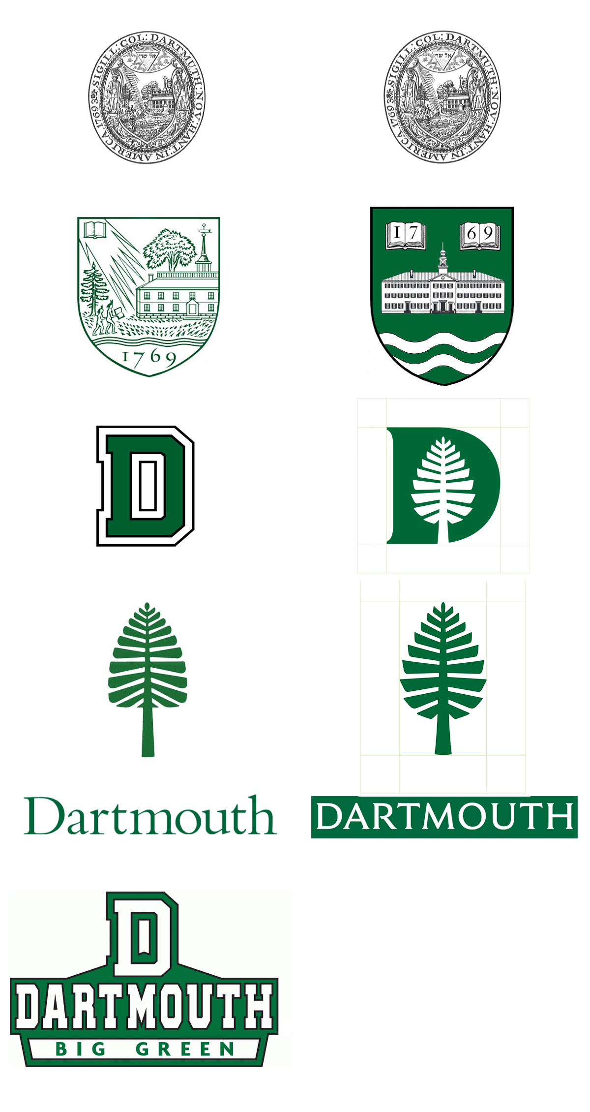
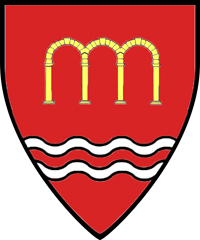
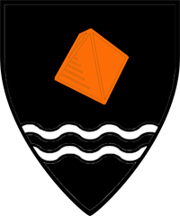
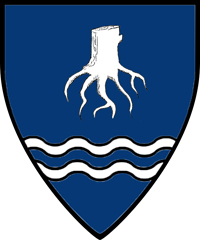
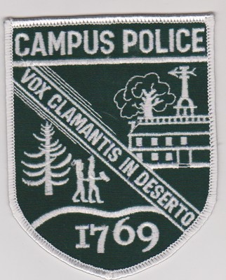
It seems likely that the group will recommend the retirement of Dartmouth’s 1944/1957 coat of arms, the familiar shield depicting a pair of Native Americans walking toward a college building (not Dartmouth Hall but a generic college or, at best, a Dartmouth Hall precursor).
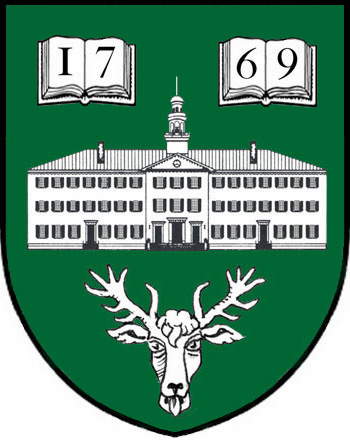
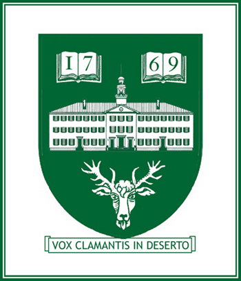
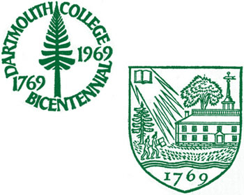
Jonathan Good’s Proposal for a Heraldic Coat of Arms for Dartmouth College anticipated this retirement decades ago and suggested an appropriate replacement.
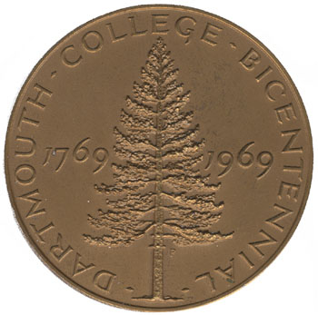
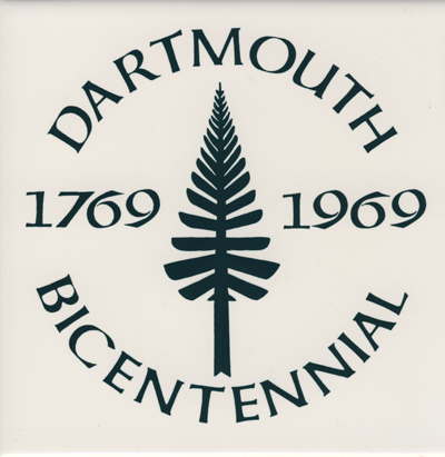
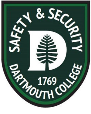
It is important that Dartmouth, while retiring its current coat of arms, create a replacement coat of arms. There is a risk that the college will do nothing and that the D-Pine, a fine less-formal symbol particularly suited to athletics (notwithstanding its description by the Office of Communications as “the most formal brand mark”) will become the official symbol of Dartmouth College.
Any iconography decision will apparently not affect the naming of the Geisel School of Medicine (Inside Higher Ed).
Dartmouth NEXT, a sort of Great Issues for the world, uses the map (or really the pattern) of paths on the Green in a graphical way to form a right-pointing arrow logo:

A course exhibit from April 2020 titled The Indian Symbol at Dartmouth: A Story of Voices and Silence contains a number of notable documents from the archives. The 1932 article on “the new official insignia,” for example, is very interesting and brings to light an obscure design. One note: The Eleazar Wheelock Tombstone, which is carved (not stamped) with a version of the Indian head symbol, is actually a non-funerary monument located in Columbia, Connecticut. Wheelock is buried in Hanover, N.H.


